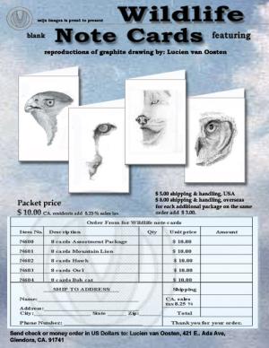
Flyer note cards one
This is an advertisement flyer26 total reviews
Comment from NIREartworks
1. it didnt overly grab my attention
2.yeah was clear what u were selling
3. yeah the presentationw as good :)
4. no didnt consider buying it
but all in all its a good bit of work :)
Petros
reply by the author on 18-Mar-2006
  |
1. it didnt overly grab my attention
2.yeah was clear what u were selling
3. yeah the presentationw as good :)
4. no didnt consider buying it
but all in all its a good bit of work :)
Petros
Comment Written 18-Mar-2006
reply by the author on 18-Mar-2006
-
Petros, thank you the review and taking the time to write it. Take care and cheers..LvO
Comment from The Muse Diva
Lucien, this is a fine layout, I liked all of it, and the drawings are very good. Only thing that made me stutter is the triangle atop each picture. They distracted me from the beautiful drawings. Might not matter, but there it is:) They don't quite make the fool the eye effect of 3d somehow. Not sure why. Shrug. Good luck in any case:)
reply by the author on 18-Mar-2006
|
Lucien, this is a fine layout, I liked all of it, and the drawings are very good. Only thing that made me stutter is the triangle atop each picture. They distracted me from the beautiful drawings. Might not matter, but there it is:) They don't quite make the fool the eye effect of 3d somehow. Not sure why. Shrug. Good luck in any case:)
Comment Written 18-Mar-2006
reply by the author on 18-Mar-2006
-
Muse Diva, thank you for the review maybe there isn't enough contrast between them and fo the card. will consider what you have said, take care and cheers... LvO
Comment from Bi Bond Art
I think you have layed this out excently and the colors are soothing to look at so it keeps the eye without detracting from the images , If I were in the market to purchase , I think your flyer would intice me to . There is not a lot of push here which I do appreciate . Very nice layout . Iam reading this book on web pages that sell talks about how people dont really read on ythe web they scan and you have defitnely given them something to scan . nice flyer. Bi Bond Art
reply by the author on 17-Mar-2006
|
I think you have layed this out excently and the colors are soothing to look at so it keeps the eye without detracting from the images , If I were in the market to purchase , I think your flyer would intice me to . There is not a lot of push here which I do appreciate . Very nice layout . Iam reading this book on web pages that sell talks about how people dont really read on ythe web they scan and you have defitnely given them something to scan . nice flyer. Bi Bond Art
Comment Written 15-Mar-2006
reply by the author on 17-Mar-2006
-
Bi Bond Art, thank you for taking the time to review and for your comments much appreciated.. take care & cheers LvO
Comment from kbrownvc
I like the overall look to the advertisement flyer, and you probably will get sales off of these as it is very nicely done, thank you for sharing this with us.
Kathleen
reply by the author on 17-Mar-2006
|
I like the overall look to the advertisement flyer, and you probably will get sales off of these as it is very nicely done, thank you for sharing this with us.
Kathleen
Comment Written 15-Mar-2006
reply by the author on 17-Mar-2006
-
Kathleen, thank you form taking the time to review this piece, much appreciated, have great day and cheers... LvO
Comment from mcapp
1. Did the flyer grab your attentions; did it make you stop and look? Yes.
2. Is it clear what is being advertised? Yes.
3. Do you like the layout and presentation? Yes.
4. Did it make you consider buying? Yes.
I think this looks fine!!
reply by the author on 17-Mar-2006
|
1. Did the flyer grab your attentions; did it make you stop and look? Yes.
2. Is it clear what is being advertised? Yes.
3. Do you like the layout and presentation? Yes.
4. Did it make you consider buying? Yes.
I think this looks fine!!
Comment Written 15-Mar-2006
reply by the author on 17-Mar-2006
-
mcapp, thank you for answering the questions, much apprciated ... take care & cheers... LvO
Comment from ShellyRS
You have done a great job with the layout of this flyer. The color choices fit wonderfully. THe pictures on the notecards are beautiful! Great job!
reply by the author on 14-Mar-2006
|
You have done a great job with the layout of this flyer. The color choices fit wonderfully. THe pictures on the notecards are beautiful! Great job!
Comment Written 14-Mar-2006
reply by the author on 14-Mar-2006
-
ShellyRS, thank you for the review, take care & cheers .. LvO
Comment from Diannatilley
It is well put together but since you asked my opionion, I am going to give it, OK?
!. It got my attention I am here..
2. what is being advertised is very clear.
3. Not entirely, I think it is too wordy. Meaning there is too much said in the small space your are using. The pictures of the cards, should sale themselves. (and you mistyped proud at the top...you have pound)
I would put item numbers on the order form and not in the body of the flyer.
The same with your shipping charges.
You only need to state once that there are 8 cards. Then the list of available cards tells you that you can get asst or single design.
So that is stated twice also. My thoughts are keep it simple, get their minds on your art and the cards and not clutter it up with unnessary words that are repeated.
4. yes I would consider buying as I love your work.
And with that said good luck with your venture. I wish you the best and many many sales.
If you would like me to send you a sample layout of what I am saying just private message me, with your email... I would be glad to help.
reply by the author on 14-Mar-2006
|
It is well put together but since you asked my opionion, I am going to give it, OK?
!. It got my attention I am here..
2. what is being advertised is very clear.
3. Not entirely, I think it is too wordy. Meaning there is too much said in the small space your are using. The pictures of the cards, should sale themselves. (and you mistyped proud at the top...you have pound)
I would put item numbers on the order form and not in the body of the flyer.
The same with your shipping charges.
You only need to state once that there are 8 cards. Then the list of available cards tells you that you can get asst or single design.
So that is stated twice also. My thoughts are keep it simple, get their minds on your art and the cards and not clutter it up with unnessary words that are repeated.
4. yes I would consider buying as I love your work.
And with that said good luck with your venture. I wish you the best and many many sales.
If you would like me to send you a sample layout of what I am saying just private message me, with your email... I would be glad to help.
Comment Written 14-Mar-2006
reply by the author on 14-Mar-2006
-
Diannatuilley, okay fixed the word proud... yes , thank you for the great review and the time you have spent. take care & cheers... LvO
Comment from Janrique
Its nice to have questions to answer, so I will do my best for you:
1. Yes it did grab my attention even in the thumbnail size. Partly I think due to the colours and partly the non-symmetrical arrangement of the items within it.
2. It is completely clear what you are advertising including the variations of one design or mixed pack.
3. I do like the layout and presentation - only thing I would question is having the text over the image of the cards at the bottom (sales tax) and (per package). If you had room, I feel for me, the text is better just on the plain BG and the notelets need to be clear and uninterrupted.
4. If I was looking to buy something of that nature, then I would feel that this would be different and probably superior to those I may find in the shops.
Hope that helps!
reply by the author on 14-Mar-2006
|
Its nice to have questions to answer, so I will do my best for you:
1. Yes it did grab my attention even in the thumbnail size. Partly I think due to the colours and partly the non-symmetrical arrangement of the items within it.
2. It is completely clear what you are advertising including the variations of one design or mixed pack.
3. I do like the layout and presentation - only thing I would question is having the text over the image of the cards at the bottom (sales tax) and (per package). If you had room, I feel for me, the text is better just on the plain BG and the notelets need to be clear and uninterrupted.
4. If I was looking to buy something of that nature, then I would feel that this would be different and probably superior to those I may find in the shops.
Hope that helps!
Comment Written 14-Mar-2006
reply by the author on 14-Mar-2006
-
Janrique, thank you for the review, made a few changes bases on your and others inputs , take care... hope you approve of the changes... cheers, Lucien
-
Lucien - it really looks so much better now with the text moved from over the images - bang on - perfect! Janet
Comment from faisoft
This digital note card is really eye catchy. The color contrast is nicely done. The lighting is well balanced. You have done a great job putting everything together. Excellent work.
reply by the author on 14-Mar-2006
|
This digital note card is really eye catchy. The color contrast is nicely done. The lighting is well balanced. You have done a great job putting everything together. Excellent work.
Comment Written 14-Mar-2006
reply by the author on 14-Mar-2006
-
faisoft, thank you for the review and the time to make comments baout this piece,
take care & cheers... LvO
Comment from countryboytexas
Wonderful job here buddy looks great you should try art wanted .Com thanks for sharing hope to see more of your work here and maybe there thanks like it you did well
reply by the author on 14-Mar-2006
|
Wonderful job here buddy looks great you should try art wanted .Com thanks for sharing hope to see more of your work here and maybe there thanks like it you did well
Comment Written 14-Mar-2006
reply by the author on 14-Mar-2006
-
CBT, thank you for taking the time to review, made a few changes since your look, hope you approve... take care and cheers... LvO