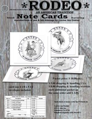
Note Cards flyer 2 RAAT
This is a flyer created using the computer21 total reviews
Comment from hapeIis
This is really great, love the perspective you've got in this.
1. Yes it did grab my attention
2. Very clear what is being advertised
3. yes I like the layout and presentation
4. IF iwere in the market for buying, yes. great work and very well presented, thank you for sharing
reply by the author on 23-Mar-2006
  |
This is really great, love the perspective you've got in this.
1. Yes it did grab my attention
2. Very clear what is being advertised
3. yes I like the layout and presentation
4. IF iwere in the market for buying, yes. great work and very well presented, thank you for sharing
Comment Written 23-Mar-2006
reply by the author on 23-Mar-2006
-
hapelis, thanks you for taking the time to look and then review this piece, much appreciated... take care and cheers... LvO
Comment from mcapp
1. Did the flyer grab your attentions; did it make you stop and look? Somewhat.
2. Is it clear what is being advertised? Yes.
3. Do you like the layout and presentation? No.
4. Did it make you consider buying? Somewhat.
I wouldn't get too fancy. It is difficult to see the designs that are layed down. It is the illustrations you are selling. That is what makes the product special.
reply by the author on 23-Mar-2006
 |
1. Did the flyer grab your attentions; did it make you stop and look? Somewhat.
2. Is it clear what is being advertised? Yes.
3. Do you like the layout and presentation? No.
4. Did it make you consider buying? Somewhat.
I wouldn't get too fancy. It is difficult to see the designs that are layed down. It is the illustrations you are selling. That is what makes the product special.
Comment Written 23-Mar-2006
reply by the author on 23-Mar-2006
-
mcapp, don't like the background? or the lettering, or the cards that are layed down, should they be more like the first flyer, all standing upright? Thank you for the time and the review really do appreciate the feed back... take care & Cheers... LvO
Comment from jandaly
This is really a wonderful flyer promoting your wonderful work of art!! I love the detail and the way you've laid it all out!! GREAT job!!
Jan :)
reply by the author on 22-Mar-2006
|
This is really a wonderful flyer promoting your wonderful work of art!! I love the detail and the way you've laid it all out!! GREAT job!!
Jan :)
Comment Written 22-Mar-2006
reply by the author on 22-Mar-2006
-
jan, thank you for taking the time to look and to review this artfrom, much appreciated, have agreat day, & cheers... LvO
Comment from NIREartworks
1. yeah these ones grabbed my attention
2. yeah its a clear whats being advertised
3. yeah its fine
4. no, i dont really buy sketches
reply by the author on 22-Mar-2006
|
1. yeah these ones grabbed my attention
2. yeah its a clear whats being advertised
3. yeah its fine
4. no, i dont really buy sketches
Comment Written 22-Mar-2006
reply by the author on 22-Mar-2006
-
Arks, thank you for the time and the review, hope all is well, much appreciated... cheers.. LvO
Comment from thirteenth
Nice job on this one. I think Rodeo should be centered, so we know its important. I also like these cards quite a lot, and am glad to see each of them well.
All of the information seems to be there now - well done persevering!
reply by the author on 22-Mar-2006
|
Nice job on this one. I think Rodeo should be centered, so we know its important. I also like these cards quite a lot, and am glad to see each of them well.
All of the information seems to be there now - well done persevering!
Comment Written 22-Mar-2006
reply by the author on 22-Mar-2006
-
thirteenth, thanks you for all your help in the past, thisa one is result of all your inputs and suggestions, really appreciated all the help... take care and cheers... LvO
Comment from redeemer
Very nicely done and yes to all of your questions. I really do not have any marketing background in art; but, I do think that you personally expressed your note cards and manner of selling very well. Thank you for sharing it with me.
reply by the author on 21-Mar-2006
|
Very nicely done and yes to all of your questions. I really do not have any marketing background in art; but, I do think that you personally expressed your note cards and manner of selling very well. Thank you for sharing it with me.
Comment Written 21-Mar-2006
reply by the author on 21-Mar-2006
-
redeermer, thank you for taking the time to look at and then review the flyer.. much appreciated... take care and cheers... LvO
Comment from sarnewfie
i think you did well on this one, though i still would like to see the bottom two better, that is your choice though! hey, maybe you will get a few sales from here!
reply by the author on 21-Mar-2006
|
i think you did well on this one, though i still would like to see the bottom two better, that is your choice though! hey, maybe you will get a few sales from here!
Comment Written 21-Mar-2006
reply by the author on 21-Mar-2006
-
sarnewfie, i hope so, we'll see (maybe you'd like to be the first?). thanks for taking the time to looks at and then review this piece... take care, & cheers... LvO
Comment from Diamondeyes
Excellent! I love the wood grain on the background! Yes, it did most certainly grab my attention! Very clear as to what is being advertised! Excellent layout and presentation! Yes, I would consider buying it! I like this one the most! The writing and I really like the angle of the cards! Excellent job. Thank you so much for sharing this.
reply by the author on 21-Mar-2006
|
Excellent! I love the wood grain on the background! Yes, it did most certainly grab my attention! Very clear as to what is being advertised! Excellent layout and presentation! Yes, I would consider buying it! I like this one the most! The writing and I really like the angle of the cards! Excellent job. Thank you so much for sharing this.
Comment Written 21-Mar-2006
reply by the author on 21-Mar-2006
-
diamondeyes, Thank you for taking the time to look and evaluation, appraise, review this piece. Very much appreciated by me, take care and cheers? LvO
Comment from Gryphons Aerie
it did grab my eye probably because of the western look it has
it would do quite well in areas where there are rodeos such as arizona or texas
nice layout maybe you could use photoshop and place a sepia like overlay on top
to give it that old west look
everything is fine about them, but I would nt buy them no offense but I just dont get into rodeos :-)
reply by the author on 21-Mar-2006
|
it did grab my eye probably because of the western look it has
it would do quite well in areas where there are rodeos such as arizona or texas
nice layout maybe you could use photoshop and place a sepia like overlay on top
to give it that old west look
everything is fine about them, but I would nt buy them no offense but I just dont get into rodeos :-)
Comment Written 21-Mar-2006
reply by the author on 21-Mar-2006
-
Gryphons Aerie, Thank you for taking the time to appraise, and review this piece. Very much appreciated by me, take care and cheers? LvO
Comment from faisoft
I like this note card a lot. The black and white color contrast is nicely done. The shadowing is well balanced. I think I see something similar before. Nice work.
reply by the author on 21-Mar-2006
|
I like this note card a lot. The black and white color contrast is nicely done. The shadowing is well balanced. I think I see something similar before. Nice work.
Comment Written 21-Mar-2006
reply by the author on 21-Mar-2006
-
faisoft, yep, this is me trying to sell my work. Thank you for taking the time to look and review this piece. Very much appreciated by me, take care and cheers? LvO