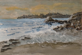
The restless sea
A coastal view of a restless sea25 total reviews
Comment from suzannethompson2
First of all, Allan, thank you for entering the contest. This is a lovely watercolour painting and I love your choice of colours - very subtle. It's quite an impressionist style, which I like. I agree that with watercolours you can go back once it has dried to add a little so long as it is not overworked as with watercolours it's the spontaneity which has the appeal.
I like how you've shown the movement in the sea - did you use masking fluid for the highlights? I like the composition of this imaginary seascape. Maybe the background land and trees could have been a little paler as they fade into the distance. The rocks are painted well showing the crevices with the waves crashing over them. I think perhaps I wouldn't have put so many clouds in the sky as the sea is so busy and the focal point of the painting.
Overall this is a lovely painting and I look forward to seeing more of your artwork. Good luck in the contest. Suzanne
reply by the author on 19-Apr-2018
  |
First of all, Allan, thank you for entering the contest. This is a lovely watercolour painting and I love your choice of colours - very subtle. It's quite an impressionist style, which I like. I agree that with watercolours you can go back once it has dried to add a little so long as it is not overworked as with watercolours it's the spontaneity which has the appeal.
I like how you've shown the movement in the sea - did you use masking fluid for the highlights? I like the composition of this imaginary seascape. Maybe the background land and trees could have been a little paler as they fade into the distance. The rocks are painted well showing the crevices with the waves crashing over them. I think perhaps I wouldn't have put so many clouds in the sky as the sea is so busy and the focal point of the painting.
Overall this is a lovely painting and I look forward to seeing more of your artwork. Good luck in the contest. Suzanne
Comment Written 19-Apr-2018
reply by the author on 19-Apr-2018
-
Thanks Suzzane for the thoughtful comments. When I was done with the painting the sky did get my attention. But at that point it was too late to modify for fear of overcooking the image. Thanks again, I very much appreciated your time and comments!
Comment from GaliaG
Wow, amazing paint, so alive and natural, it looks like I am looking at the real beach
excellent composition, presentation and initial impact
thanks for sharing
reply by the author on 19-Apr-2018
 |
Wow, amazing paint, so alive and natural, it looks like I am looking at the real beach
excellent composition, presentation and initial impact
thanks for sharing
Comment Written 19-Apr-2018
reply by the author on 19-Apr-2018
-
Wow, getting a six star from you is awesome. I appreciate that and it will help as a confidence boost going forward, so THANKS!!!!
Comment from Melyuki
Hi Allan thanks for sharing your delightful painting - Movement in Water.. rendered in watercolours.. You have certainly achieved a good feeling of movement on the ocean floor with your varied brush strokes and the use of white highlights which offer texture and depth to the sea.. I like the use of deeper blue hues under the white splash in various sections of the painting. this shows off the wave and gives it depth.. and is visually appealing to the eye. Perhaps as the ocean stretches towards the horizon in the background, you could deepen the blue hue to reflect the deeper water.. just a thought.. which in turn offers good depth of field, as does the distant headland with the scattered trees lining its surface.. The rocks in the foreground are nicely blended with brown earthy tones, giving them good textural value and the odd splashes of white add to their visual appeal. The receding tide in the foreground is well rendered with longer brush strokes which appear to be more vertical than the strokes used on the ocean behind.. Gives the effect that the waves are sweeping back against the incoming flow.. and offers good feeling of movement . Perhaps that line of water that runs next to the sandy shoreline, could be more jaggered and wiggly in its effect for better balance and eye appeal.. that is purely a personal thought in my mind's eye.. I love the shadowed sand in the foreground. it shows the wet sand nicely, as left by that receding tide line. The colour is excellent and resembles true to life sand well. The sky has a good balance of colour, with the fleeting clouds blended nicely with their slightly orange hue contrasting against the hazy tone of the sky. The scene is well balanced showing the rocks on the left in the foreground and the larger more defined rocks on the right. The headland in the background provides good contrast and is a nice border line between the sea and sky.. ( just a personal preference once again.... if the horizon line and sea was horizontal to the top edge of the painting, it would offer a more balanced visual display in my mind's eye.. ) though truly it doesn't devalue the beauty of the scene ... ... You asked for honest opinions and those things are minor which I have mentioned and are no reflection on the rendering itself. I am not a water colour expert as I am fairly new to painting and use acrylics.. so in my eyes, you have created a wonderful view that certainly has lots of movement in the blanket of sea that stretches from the shoreline to the horizon.. the painting emanates a refreshing pleasing emotion and has been a true joy to review.. please forgive me for offering my own personal viewpoints.. as they really play very little role in making your already excellent painting better... .. thanks for sharing Allan.. cheers mel
reply by the author on 19-Apr-2018
|
Hi Allan thanks for sharing your delightful painting - Movement in Water.. rendered in watercolours.. You have certainly achieved a good feeling of movement on the ocean floor with your varied brush strokes and the use of white highlights which offer texture and depth to the sea.. I like the use of deeper blue hues under the white splash in various sections of the painting. this shows off the wave and gives it depth.. and is visually appealing to the eye. Perhaps as the ocean stretches towards the horizon in the background, you could deepen the blue hue to reflect the deeper water.. just a thought.. which in turn offers good depth of field, as does the distant headland with the scattered trees lining its surface.. The rocks in the foreground are nicely blended with brown earthy tones, giving them good textural value and the odd splashes of white add to their visual appeal. The receding tide in the foreground is well rendered with longer brush strokes which appear to be more vertical than the strokes used on the ocean behind.. Gives the effect that the waves are sweeping back against the incoming flow.. and offers good feeling of movement . Perhaps that line of water that runs next to the sandy shoreline, could be more jaggered and wiggly in its effect for better balance and eye appeal.. that is purely a personal thought in my mind's eye.. I love the shadowed sand in the foreground. it shows the wet sand nicely, as left by that receding tide line. The colour is excellent and resembles true to life sand well. The sky has a good balance of colour, with the fleeting clouds blended nicely with their slightly orange hue contrasting against the hazy tone of the sky. The scene is well balanced showing the rocks on the left in the foreground and the larger more defined rocks on the right. The headland in the background provides good contrast and is a nice border line between the sea and sky.. ( just a personal preference once again.... if the horizon line and sea was horizontal to the top edge of the painting, it would offer a more balanced visual display in my mind's eye.. ) though truly it doesn't devalue the beauty of the scene ... ... You asked for honest opinions and those things are minor which I have mentioned and are no reflection on the rendering itself. I am not a water colour expert as I am fairly new to painting and use acrylics.. so in my eyes, you have created a wonderful view that certainly has lots of movement in the blanket of sea that stretches from the shoreline to the horizon.. the painting emanates a refreshing pleasing emotion and has been a true joy to review.. please forgive me for offering my own personal viewpoints.. as they really play very little role in making your already excellent painting better... .. thanks for sharing Allan.. cheers mel
Comment Written 19-Apr-2018
reply by the author on 19-Apr-2018
-
Holy cow, what a terrific review of this painting. I especially like your suggestions on what you might have done. A second set of eyes can often see things the original artist overlooked, so thanks for your honest opinion.
You spend a great deal of time on this which is not always typical on a FAR review, so I want you to know how much I appreciate your effort, THANKS!
Comment from ArtistCharles
Allan this is a nice image. Not perfect but nice.The basic composition is good. There is a nice sense of movement in the water. The waves are well drawn/painted to create the shape and surf movement. The larger rocks are well formed. The 6 or 7 rocks in the lower left are not clearly delineated. I think the sky is weak. Some more color would help to bring it out. It is hard to judge your painting technique or strokes from a photo, but they look okay. Well conceived.
reply by the author on 19-Apr-2018
|
Allan this is a nice image. Not perfect but nice.The basic composition is good. There is a nice sense of movement in the water. The waves are well drawn/painted to create the shape and surf movement. The larger rocks are well formed. The 6 or 7 rocks in the lower left are not clearly delineated. I think the sky is weak. Some more color would help to bring it out. It is hard to judge your painting technique or strokes from a photo, but they look okay. Well conceived.
Comment Written 19-Apr-2018
reply by the author on 19-Apr-2018
-
Thanks for your gracious review, I will settle for nice, perfect for me is unachievable! :)
I appreciate your suggestions.
Comment from Joyce GR
Are you for real? Did you say that you were new to painting?
Well you should stick to it because this painting is excellent. The waves and rocks are so real, the sea color, sand,and sky depict an early evening. I am a very honest person so I garantee this review is genuine. Please continue painting.
reply by the author on 19-Apr-2018
|
Are you for real? Did you say that you were new to painting?
Well you should stick to it because this painting is excellent. The waves and rocks are so real, the sea color, sand,and sky depict an early evening. I am a very honest person so I garantee this review is genuine. Please continue painting.
Comment Written 18-Apr-2018
reply by the author on 19-Apr-2018
-
Thanks Joyce, your comments are a real confidence boost, making me what to try another piece. I have done acrylics for a long time, but always struggled with water color. Youtube vids are very useful in techniques.
-
You?re welcome
Comment from bpellephoto
The piece of art I see before me presents itself as simple realism portraying a nostalgic atmosphere in luminous color.
Reminiscent of the folk art primitive style of Anna Mary Robertson Moses AKA - Grandma Moses.
You have a good handle on perspective of scale and depth.
I like the color choices for the sky in the background.
One thing I might mention here is maybe soften your brush strokes for the surf.
The overall impression I take away from this piece is that there should be something more. That this scene is void of something and I wish I could be more explicit than that.
Keep at it I think you have a lot to share with your art ... B-)) Bob
reply by the author on 19-Apr-2018
|
The piece of art I see before me presents itself as simple realism portraying a nostalgic atmosphere in luminous color.
Reminiscent of the folk art primitive style of Anna Mary Robertson Moses AKA - Grandma Moses.
You have a good handle on perspective of scale and depth.
I like the color choices for the sky in the background.
One thing I might mention here is maybe soften your brush strokes for the surf.
The overall impression I take away from this piece is that there should be something more. That this scene is void of something and I wish I could be more explicit than that.
Keep at it I think you have a lot to share with your art ... B-)) Bob
Comment Written 18-Apr-2018
reply by the author on 19-Apr-2018
-
Thanks for your honest comments, I am learning and find your comments most helpful.
Most past attempts of water color I could not post on FAR for fear of involuntary termination! :)
Comment from nature rules
Well..I'm just completely impressed...this is not third grade level! Your colors are the initial impact for me... they have been blended into very rich tones that do not meld into some awful shade of icky brownish green as mine so often do.. Your blues are beautiful your yellows in the sunrise....I see those more often than sunsets.. are true and again...blended nicely into the grays of the sky. And I like the rust color on the right margin... but it might be a bit too unique to the scene as a whole...unless is spreads itself out a bit.
When I use the squint test I see mostly all good things. I'm not sure about the distant peninsula..whether it is wooded or rock formations. But the sky and the water and the lower beach pass the test completely in textures, lights and shadows and color themes.. Well done Allan and a pleasure to view. I will be sure to check out your reviews on this one and hope to learn past 1st grade level... :D Thanks for sharing.
reply by the author on 18-Apr-2018
|
Well..I'm just completely impressed...this is not third grade level! Your colors are the initial impact for me... they have been blended into very rich tones that do not meld into some awful shade of icky brownish green as mine so often do.. Your blues are beautiful your yellows in the sunrise....I see those more often than sunsets.. are true and again...blended nicely into the grays of the sky. And I like the rust color on the right margin... but it might be a bit too unique to the scene as a whole...unless is spreads itself out a bit.
When I use the squint test I see mostly all good things. I'm not sure about the distant peninsula..whether it is wooded or rock formations. But the sky and the water and the lower beach pass the test completely in textures, lights and shadows and color themes.. Well done Allan and a pleasure to view. I will be sure to check out your reviews on this one and hope to learn past 1st grade level... :D Thanks for sharing.
Comment Written 18-Apr-2018
reply by the author on 18-Apr-2018
-
Hey, your review was just what I was looking for. I think the bg hills need to show some trees, not just rocks, check. The "rock" on the right bothered me also. It is just like a big bad blob looking for a fight. I need to address that attitude, check.
What I learned about WC recently is that you CAN come back and back again to address it. In the past I always tried to finish a painting in one setting. This usually resulted in wet on wet painting and the inevitable muddy look to it. If one is patience and lets the image dry first, come back later, one can accentuate tone and add small highlights. So that advanced me from 3rd grade to fifth grade.
So I am looking forward to getting back to this painting and to address the items you pointed out.
Good eye there Becky!!! and of course Thanks again!
-
You are most welcome... Hope this turns into a shared tutorial!
-
I did add some trees to the distant hills and modified the rock on the right, per your excellent eye. Thanks Becky!
-
I read your reviews...You got some excellent feedback!!! Did you stay up all night! I can see your improvements...and they are good!! Really good!
-
Indeed, I appreciated the feedback! I made changes, but only slightly as I fear overworking a piece, my forte! :)
-
The reflections on your beach are a huge improvement as are your distant, a bit foggy trees! Great advice in some of your reviews. Nice that those artists took the time and are confident to share some of their methods... eh.
-
Yes, funny what a little support will do, like all of yours! 😉
-
Thanks Allan....but I am a lover of art...not a creator so much..
-
All of your posts are a creation of art, which is reflected in your outstanding award for 2017! :)
-
I can't get my garden hat on!....
Comment from Minnie Kaye
you have created a lovely seascape scene.
The detailed strokes in your waves are really done we..
I love the skyline, looks like it was a beautiful day but now a storm is coming.
Nice piece, thanks for sharing.
reply by the author on 18-Apr-2018
|
you have created a lovely seascape scene.
The detailed strokes in your waves are really done we..
I love the skyline, looks like it was a beautiful day but now a storm is coming.
Nice piece, thanks for sharing.
Comment Written 18-Apr-2018
reply by the author on 18-Apr-2018
-
Thanks Minnie for your nice review. Yes a storm is brewing the the waves have picked up. Head for shelter!! :)
-
You are welcome, great job.
Comment from PeglegDeb
Well good for you Allan! I know exactly how you feel about working w/ watercolors at above a third grade level and I think you've achieved that in a really grand way! Beautiful piece for this contest.
Your color mixing is wonderful. Wow but that sky...and the water right where it rolls onto the beach is perfect. But it's not only the color mixing, you've also clearly defined rocks, ocean and waves. Now it's been a number of years since I've even TRIED watercolors so offering advice etc is beyond me but I really like this piece...a LOT. You should definitely keep working w/ those watercolors....and hang this up on your wall somewhere. Best of luck w/ it in the contest.
Deborah
reply by the author on 18-Apr-2018
|
Well good for you Allan! I know exactly how you feel about working w/ watercolors at above a third grade level and I think you've achieved that in a really grand way! Beautiful piece for this contest.
Your color mixing is wonderful. Wow but that sky...and the water right where it rolls onto the beach is perfect. But it's not only the color mixing, you've also clearly defined rocks, ocean and waves. Now it's been a number of years since I've even TRIED watercolors so offering advice etc is beyond me but I really like this piece...a LOT. You should definitely keep working w/ those watercolors....and hang this up on your wall somewhere. Best of luck w/ it in the contest.
Deborah
Comment Written 18-Apr-2018
reply by the author on 18-Apr-2018
-
Thank you Deborah, I appreciate your support. I kind of need this piece to do OK as I am on the fence as to continue my watercolor forays or not. I love the thought of doing it, I love the mood it can create, but in the end one has to see progress. So with your review, I will call that progress! Thanks so much!
-
Allan if I could paint like this w/ watercolors I would haul all my little containers of watercolors back out and go to town. I can't but YOU can so you are very welcome and I meant what I said about hanging this on your wall....and seriously hope to see you post more of your foray into watercolors!!
-
With your encouragement, it is back to the youtube presentations to learn more (and eagerly so).
-
Thank you so much, with encouragement like that it is back to youtube to learn more, with great pleasure also.
-
Oh good Allan. You go for it now. Will be watching and waiting.
Comment from Linda Wetzel
I think water colors are a very unforgiving medium so I admire your commitment to keep trying. Thank goodness for these contests that make us keep trying things out of our comfort zone. Your sky in this piece is just beautiful. This is definitely above a grade school level so do not beat yourself up. Your sea is good and has good movement. Waves are hard in a medium where you get do overs. The only issue I see is that your waves at the beach stop a little abruptly. I think you need to add a few wavy edges in the foreground in a dark brown to create wet sand. You could then touch the tops of these wavy lines with just a hint of white to represent the receding foam. Overall it is a very nice composition for this contest. I did not detract points for my suggestion as it does not bother me that the waves stop short, but you did ask for suggestions. Good luck.
reply by the author on 18-Apr-2018
|
I think water colors are a very unforgiving medium so I admire your commitment to keep trying. Thank goodness for these contests that make us keep trying things out of our comfort zone. Your sky in this piece is just beautiful. This is definitely above a grade school level so do not beat yourself up. Your sea is good and has good movement. Waves are hard in a medium where you get do overs. The only issue I see is that your waves at the beach stop a little abruptly. I think you need to add a few wavy edges in the foreground in a dark brown to create wet sand. You could then touch the tops of these wavy lines with just a hint of white to represent the receding foam. Overall it is a very nice composition for this contest. I did not detract points for my suggestion as it does not bother me that the waves stop short, but you did ask for suggestions. Good luck.
Comment Written 18-Apr-2018
reply by the author on 18-Apr-2018
-
Thank you so much Linda, your comments are exactly what I was looking for. Another set of eyes that are not biased as we all are about our work. I will work on the suggestions you proposed and repost when I get a chance.
I am encouraged by your words!! Thanks!!
-
Oh, it was my pleasure. So glad you were not offended.
-
I did go back to the the painting and changed per your comments. I tried not to overdue it, but did add some wet sand and feathered the waves a bit more. So many thanks again!