Contest Winners - Photos
Viewing comments for Page 39 "Oh NO, not Ketchup"Contest winners from 2010-2014
49 total reviews
Comment from Efffell
A proud AND very talented Granny looking forward to a happy (and possbly a profitable) retire ment...Please don't lose your sends of fun and humour demonstrated in the charming and lovely PIC...Best wishes Monty
reply by the author on 12-Jan-2014
        |
A proud AND very talented Granny looking forward to a happy (and possbly a profitable) retire ment...Please don't lose your sends of fun and humour demonstrated in the charming and lovely PIC...Best wishes Monty
Comment Written 11-Jan-2014
reply by the author on 12-Jan-2014
-
Thank you so very much for the lovely review and also for the generous rating.
Comment from Dick Lee Shia
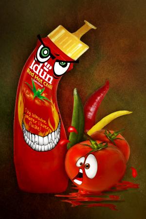
Nice personification of popular food product given an amusing touch to best interpret the contest theme.
Great details.
Color contrast.
Excellent font.
Nice lighting.
Sharp focusing.
Aesthetic framing.
Thanks for sharing.
reply by the author on 17-Dec-2013
      |
Nice personification of popular food product given an amusing touch to best interpret the contest theme.
Great details.
Color contrast.
Excellent font.
Nice lighting.
Sharp focusing.
Aesthetic framing.
Thanks for sharing.
Comment Written 16-Dec-2013
reply by the author on 17-Dec-2013
-
Thank you so very much for the lovely review
Comment from suffolkbrian
bit of artistry as well as humor,different one for the contest,really good one this,just shows what you can do with a bit of imageination,well done...brian
reply by the author on 17-Dec-2013
      |
bit of artistry as well as humor,different one for the contest,really good one this,just shows what you can do with a bit of imageination,well done...brian
Comment Written 16-Dec-2013
reply by the author on 17-Dec-2013
-
Thank you so very much for the lovely review
-
your welcome
Comment from paulah
creative, nicely art directed, amusing, attention getting, colorful but red steals the show. Composition and framing direct attention to the eyes of your characters, their faces are very good from an animation style perspective.
reply by the author on 17-Dec-2013
        |
creative, nicely art directed, amusing, attention getting, colorful but red steals the show. Composition and framing direct attention to the eyes of your characters, their faces are very good from an animation style perspective.
Comment Written 15-Dec-2013
reply by the author on 17-Dec-2013
-
Thank you so very much for the lovely review and also for the generous rating.
Comment from slhbowen
I actually laughed out loud! This is fantastic! What a wonderful take on RED! Great humor, great execution, wonderful expressions!
reply by the author on 17-Dec-2013
      |
I actually laughed out loud! This is fantastic! What a wonderful take on RED! Great humor, great execution, wonderful expressions!
Comment Written 15-Dec-2013
reply by the author on 17-Dec-2013
-
Thank you so very much for the lovely review
Comment from MinoYasue
I guess you draw the facial features - teeth and teeth etc. By this, you are a great artist as well. I would like to see your paintings after the contest is over (right now, I do not who you are). I am taken how creative this is! The initial impact and the story telling are great. Thank you for sharing.
reply by the author on 17-Dec-2013
      |
I guess you draw the facial features - teeth and teeth etc. By this, you are a great artist as well. I would like to see your paintings after the contest is over (right now, I do not who you are). I am taken how creative this is! The initial impact and the story telling are great. Thank you for sharing.
Comment Written 15-Dec-2013
reply by the author on 17-Dec-2013
-
Thank you so very much for the lovely review
Comment from RochelleW
This is a hilarious composition. I love it. It made me laugh out loud. Great impact and detail. The lighting is perfect, and the colors are so bright and vivid. You're focus is very crisp and sharp. Fantastic work!!! Thanks for sharing!!!
reply by the author on 17-Dec-2013
      |
This is a hilarious composition. I love it. It made me laugh out loud. Great impact and detail. The lighting is perfect, and the colors are so bright and vivid. You're focus is very crisp and sharp. Fantastic work!!! Thanks for sharing!!!
Comment Written 15-Dec-2013
reply by the author on 17-Dec-2013
-
Thank you so very much for the lovely review
Comment from Lethal005
excellent humour
brilliant red
great character detail
love the teeth and the eyes and in facy everything about this
well done
reply by the author on 17-Dec-2013
      |
excellent humour
brilliant red
great character detail
love the teeth and the eyes and in facy everything about this
well done
Comment Written 14-Dec-2013
reply by the author on 17-Dec-2013
-
Thank you so very much for the lovely review
Comment from BirdsEyeView
very hot, the detail, clarity well done. the action and expression is well done with illustration of composition. color, contrast sharp. BEV
reply by the author on 17-Dec-2013
      |
very hot, the detail, clarity well done. the action and expression is well done with illustration of composition. color, contrast sharp. BEV
Comment Written 14-Dec-2013
reply by the author on 17-Dec-2013
-
Thank you so very much for the lovely review
Comment from Thia
This is a lot of fun!!! Great job merging so many images and making it look so cohesive. I really like the colours of the Chili and tomato against the back ground. Yes you did bring a smile to my face. Thank you!
reply by the author on 17-Dec-2013
      |
This is a lot of fun!!! Great job merging so many images and making it look so cohesive. I really like the colours of the Chili and tomato against the back ground. Yes you did bring a smile to my face. Thank you!
Comment Written 14-Dec-2013
reply by the author on 17-Dec-2013
-
Thank you so very much for the lovely review
