
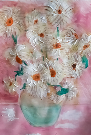
My Gogh style chrysanthemums
Crisanthemums in a vase10 total reviews
Comment from Devonte Baker
These are beautiful flowers that you created. Your composition of colors using color pencils is amazing. Beautifully done, thank you for sharing!
reply by the author on 06-Jul-2025
  |
These are beautiful flowers that you created. Your composition of colors using color pencils is amazing. Beautifully done, thank you for sharing!
Comment Written 03-Jul-2025
reply by the author on 06-Jul-2025
-
Thank you so much for reviewing and your comments. I have really enjoyed creating art recently using coloured pencils they are a challenge but I find working with them quite absorbing
Comment from Ray Gordon
Brenda so nice. great job on this beautiful piece . You have used your skills to create this and I think. You have wonderful eyes to see and this proves itI love it. Ray
reply by the author on 22-Jun-2025
|
Brenda so nice. great job on this beautiful piece . You have used your skills to create this and I think. You have wonderful eyes to see and this proves itI love it. Ray
Comment Written 21-Jun-2025
reply by the author on 22-Jun-2025
-
An unusual compliment..thank you Ray very much.
Comment from Mattie Stienike
This is absolutely beautiful! You captured the depth of the flowers with the amazing shading and use of colors. I love the orange it makes the flowers pop. The pink background is perfect it draws the attention to the vase. I also am obsessed with the texture!
reply by the author on 22-Jun-2025
 |
This is absolutely beautiful! You captured the depth of the flowers with the amazing shading and use of colors. I love the orange it makes the flowers pop. The pink background is perfect it draws the attention to the vase. I also am obsessed with the texture!
Comment Written 21-Jun-2025
reply by the author on 22-Jun-2025
-
Thank you..your review is special and highlights how I was hoping this would be seen by viewers. Your comments are so appreciated
Comment from ArtistCarl
First impression was, 'oh I like this.' I like the overall softness of colors in the supporting background and vase juxtaposed with the flower bright textures. Good composition of the flowers making the viewer bounce back and forth between scattered vision and focused vision on each flower one at a time. Reasons for my five star vote.
reply by the author on 22-Jun-2025
|
First impression was, 'oh I like this.' I like the overall softness of colors in the supporting background and vase juxtaposed with the flower bright textures. Good composition of the flowers making the viewer bounce back and forth between scattered vision and focused vision on each flower one at a time. Reasons for my five star vote.
Comment Written 21-Jun-2025
reply by the author on 22-Jun-2025
-
Thank you for a helpful critique ...you comments are much appreciated
-
You are welcome.
Comment from MKFlood
nice soft colors here. the floral forms is good. the details is good but i do think a lil gray at the edge can help separate the floral forms.. the depth is good. the blend of the colors is good. the vase form is good. the presentation is balanced and eye appealing to the viewer. creative and good job overall
reply by the author on 22-Jun-2025
|
nice soft colors here. the floral forms is good. the details is good but i do think a lil gray at the edge can help separate the floral forms.. the depth is good. the blend of the colors is good. the vase form is good. the presentation is balanced and eye appealing to the viewer. creative and good job overall
Comment Written 21-Jun-2025
reply by the author on 22-Jun-2025
-
Thank you Mark for reviewing and comments. I am not sure where you mean for the gray..I am always ready to improve. Do you mean around the flower heads in overlaps?
-
Yes..black is too dark it makes it cartoon..so that is why suggested gray..yes helps separate the flowers
Comment from Elisabetta Warner
Goodmorning
This is a lovely painting
I love the colouring and texture
The 3 D image is amazing and captivating
Thanks for sharing
Hope this helps
reply by the author on 22-Jun-2025
|
Goodmorning
This is a lovely painting
I love the colouring and texture
The 3 D image is amazing and captivating
Thanks for sharing
Hope this helps
Comment Written 21-Jun-2025
reply by the author on 22-Jun-2025
-
Thank you. Your reviewing is always helpful and appreciated
Comment from Kirsten Shonle
I absolutely love this. Yes I get a feel of Van Goh. The flowers are great. I love the vase. The background really adds to this piece. There is nice dimension used here as well. Thanks for sharing.
reply by the author on 22-Jun-2025
|
I absolutely love this. Yes I get a feel of Van Goh. The flowers are great. I love the vase. The background really adds to this piece. There is nice dimension used here as well. Thanks for sharing.
Comment Written 21-Jun-2025
reply by the author on 22-Jun-2025
-
Thank you for your review which is much appreciated
Comment from seshadri_sreenivasan
I admire how you've balanced detail and abstraction here. The precision in your lines contrasts beautifully with the free-flowing forms �" it's both technically stunning and emotionally evocative. Well done!
reply by the author on 22-Jun-2025
|
I admire how you've balanced detail and abstraction here. The precision in your lines contrasts beautifully with the free-flowing forms �" it's both technically stunning and emotionally evocative. Well done!
Comment Written 21-Jun-2025
reply by the author on 22-Jun-2025
-
What lovely comments you made in your review...thank you so much
Comment from nikman
Quite an interesting image posted here with a good reference to a famous artist too! Your fine, full and appropriate composition offers us a very enjoyable view of those lovely blooms and vase. Nicely created!
reply by the author on 07-Jun-2025
|
Quite an interesting image posted here with a good reference to a famous artist too! Your fine, full and appropriate composition offers us a very enjoyable view of those lovely blooms and vase. Nicely created!
Comment Written 06-Jun-2025
reply by the author on 07-Jun-2025
-
Thank you
Comment from Maureen Woychyshyn
A very interesting and unique, visual presented here. Composition shades, and tones are very lovely. . The background seems to take over from the subject you are highlighting. ( your flowers and vase). My suggestion would be to soften the pinks. Thank you for sharing.
reply by the author on 07-Jun-2025
  |
A very interesting and unique, visual presented here. Composition shades, and tones are very lovely. . The background seems to take over from the subject you are highlighting. ( your flowers and vase). My suggestion would be to soften the pinks. Thank you for sharing.
Comment Written 06-Jun-2025
reply by the author on 07-Jun-2025
-
I see what you mean. It was intentional that it merged rather than popped. However I am still playing about with this and appreciate your input. I will probably end up overworking it. It can happen so easily when you keep going back.