
The book of postcards.
Viewing comments for Page 143 "Wow"garphic design efforts, postcards
19 total reviews
Comment from wrhosie935
I think the reaction is WOW. You sure know how to get the message across. Nice choice of colors and sealing them in the wavy design. I will check out the gallery, of course.
reply by the author on 22-Jun-2008
  |
I think the reaction is WOW. You sure know how to get the message across. Nice choice of colors and sealing them in the wavy design. I will check out the gallery, of course.
Comment Written 21-Jun-2008
reply by the author on 22-Jun-2008
-
wrhosie935,
will be looking for you at the next artist reception. you should coemthen and meet some of teh other atrists on display, there is some really great work to look at and be inspired by... take care and cheers!
Lucien
Comment from terrifictoby
Works for me! Talk about sending me back to the 60's. Great vibrant colors and definitely draws your attention. If I lived in California, I definitely would drop by. Very good job of commercial art. You succeeded in doing what you intended to do.
reply by the author on 22-Jun-2008
|
Works for me! Talk about sending me back to the 60's. Great vibrant colors and definitely draws your attention. If I lived in California, I definitely would drop by. Very good job of commercial art. You succeeded in doing what you intended to do.
Comment Written 21-Jun-2008
reply by the author on 22-Jun-2008
-
terrifictoby,
yes it does that doesn't it... it get the attention... anyway thanks for the time and the comments... please it took you back to a different time and place. take care and cheers!
Lucien
Comment from amanda andrews
what a great wow factor lol crazy colors!!i love the "o" great adaption of the mouth!! the strong clors work welland the black out line made the whole thing stand out more wel done
amanda
reply by the author on 21-Jun-2008
|
what a great wow factor lol crazy colors!!i love the "o" great adaption of the mouth!! the strong clors work welland the black out line made the whole thing stand out more wel done
amanda
Comment Written 21-Jun-2008
reply by the author on 21-Jun-2008
-
amanda,
you caught onto the design intent of the lettering in the word WOW, do you like the way the "W's" look like two people with raised arms... cheering? anyway thank you for the review, you support is appreciated by me on all counts... have great day and cheers!
Lucien
Comment from Steve Edwards
Hello Lucian. My, this definitely has that WOW factor...LOL.
Love the rainbow of colors in this. Looks like a poster from the 60s. A real eyecatcher and that's what you want in an advertisement. Fine job!
reply by the author on 21-Jun-2008
|
Hello Lucian. My, this definitely has that WOW factor...LOL.
Love the rainbow of colors in this. Looks like a poster from the 60s. A real eyecatcher and that's what you want in an advertisement. Fine job!
Comment Written 21-Jun-2008
reply by the author on 21-Jun-2008
-
Steve,
gald you like this image, definitely a 60 type of design, gald it caught your attention, take care and i appreciate the support... cheers!
Lucien
Comment from jgrace
Very nice design. I like the WOW that hits you the moment you look at it. Colors you chose really makes it pop out at you. Your ad works very well and if I happened to be in the area, I would definitely check it out. Well done.
reply by the author on 21-Jun-2008
|
Very nice design. I like the WOW that hits you the moment you look at it. Colors you chose really makes it pop out at you. Your ad works very well and if I happened to be in the area, I would definitely check it out. Well done.
Comment Written 21-Jun-2008
reply by the author on 21-Jun-2008
-
jgrace,
thanks for the review and do stop by and see the show, i have several pieces on display. take care and cheers!
Lucien
Comment from Brianm24
It certainly does that Lucien, like the vivid colors and the Wow, would certainly get someones attention, good Luck with the Exhibition, I would certainly come if i was closer, ..Brian
reply by the author on 21-Jun-2008
|
It certainly does that Lucien, like the vivid colors and the Wow, would certainly get someones attention, good Luck with the Exhibition, I would certainly come if i was closer, ..Brian
Comment Written 21-Jun-2008
reply by the author on 21-Jun-2008
-
Brianm24,
gald you like this, not as tame as the one I sent you. anyway thanks for the time and the review, and i do beleive you would come if the show was to be held in your neck of the woods. appreciate the support, and take care.. cheers!
Lucien
Comment from jesuel
what a cool design you are definately a professional the color composition is great the lettering is perfect you are definately a master of your craft great job
reply by the author on 21-Jun-2008
|
what a cool design you are definately a professional the color composition is great the lettering is perfect you are definately a master of your craft great job
Comment Written 21-Jun-2008
reply by the author on 21-Jun-2008
-
jesuel,
thanks for the comments, appreciate you supporting me an my work.
I just got back from a trip and guess what, I can no longer can review your artwork. you mad at me, or something? (seen the nude I posted?)
take care, hope all is well with you cheers!
Lucien
-
no im not mad i hit the button by accident i will go in later and see if i can cancel it
Comment from jamber82
It caught my attention pretty well. I like the Shameless self-promotors thing....isn't that what we all are here? LOL its a pretty cool invite, and Bubba, I would really like to go, but Ohio to LA is alot of directions to put on one small card!!!
This rating does not count towards story rating or author rank.
The highest and the lowest rating are not included in calculations.
reply by the author on 21-Jun-2008
|
It caught my attention pretty well. I like the Shameless self-promotors thing....isn't that what we all are here? LOL its a pretty cool invite, and Bubba, I would really like to go, but Ohio to LA is alot of directions to put on one small card!!!
This rating does not count towards story rating or author rank.
The highest and the lowest rating are not included in calculations.
Comment Written 21-Jun-2008
reply by the author on 21-Jun-2008
-
jamber82,
thank you for the time you have taken to look and then write me your thoughts about the postcard. It is apprceciated by me on all counts, maybe some day I'll get out your way. take care and cheers!
Lucien
Comment from Iconoclast
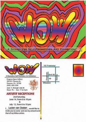
This pops visually. The front of the card is inviting and friendly enough to make the recipient flip and read the text on the reverse where it was a good idea to repeat the motif. Subhead on front is readable yet does not interfere with the WOW art. I like the simplicity of the text: Who, what, when and where. And its always a good idea to include a map. If I were still running an advertising, I'd approve this layout and let you present it to the client.
reply by the author on 21-Jun-2008
  |
This pops visually. The front of the card is inviting and friendly enough to make the recipient flip and read the text on the reverse where it was a good idea to repeat the motif. Subhead on front is readable yet does not interfere with the WOW art. I like the simplicity of the text: Who, what, when and where. And its always a good idea to include a map. If I were still running an advertising, I'd approve this layout and let you present it to the client.
Comment Written 21-Jun-2008
reply by the author on 21-Jun-2008
-
Iconoclast,
so where is it lacking? thanks for the review and time taken to write it, It is appreciated by on all counts... take care and cheers!
Lucien
-
Font chosen for subhead on front could better match the art. Same with text on reverse. Kerning is imperfect on reverse text, a detail often ignored in today's age of computer typesetting. Art Directors were afraid to question me Lucien so I could make inane suggestions on a whim. Ahhhh, the evil pleasures of Power.
-
One of my favorite comic book writer said through one of his characters, "With Asolute Power comes great respeosibility!"
about the text and the kerning. teh wow portion was designed by me as you have already guessed, two things there that I wanted to acheive, one the open mouth feeling in the "O" and the idea of two people cheering arms up in the "W's" on each side. Yes, the lettering on the front is plan and that was to not take away from the WOW! the kerning there is what I wanted and is very tight on the WOW.
on the back, help me out here and yes, I was lazy and used the computer program Photoshop, what area strongly offends your editors mind and eye in how the type has been set up? like the area around the logo? or the spacing between the lines and the artist reception? I would like to know.
I am thinking of designing a coffee art book of my stipple and pointillism images. Like I want to design the cover and the entire book lay out, yes I know a really daunting task, but I want to do it... the biggest thing will be the title and the text used there on the cover, actually the entire cover layout... if it does not pop, grab the attention of the viewer, no sale... know what I mean?
Thanks for the inputs and the support... and watch out how you use that power.. from; me have fun with it and cheers!
Lucien
-
Your right, covers sell books. But being on The Oprah Show REALLY sells books. The two cheering hands of the twin Ws in WOW? Much too subtle. Perhaps 2% of the recipient's will notice that, probably less then that. Postcards are like billboards. So are book covers. You've got about two seconds to communicate a visual idea to a potential buyer. To see an excellent example of an animated font note Nintendo's television campaign's treatment of the Wii logo. It works because it moves. Printed material does not and thus must work harder.
The cover of your book? Obviously it should be consistent with its content and I know that your content is going to be strong stuff. So show it off on the cover and choose a suitably hip and modern typeface. A font that your audience, which I imagine will be Urban Hipsters, can relate to. Look at an issue of Wired magazine that's written for this audience of educated, technologically proficient, semi-techno-snobs. Note the way they treat text - its almost unreadable to anyone outside their target audience. i.e. anyone that's not part of the internet audience. So figure out exactly the type of person who will BUY, not necessarily like, two different things, your book and design your cover for them. I'm currently shopping a graphic novel of my own and the publishing world today has one interest and one interest only: Will this book sell? By the way, I quit my lucrative job twelve years ago so I could paint and write. The jury is still out on the soundness of my decision. Good luck with your book. And my rating was based on viewing it as a promotional piece with one purpose - to generate maximum response. A concept often obscure to the Art Directors who worked for me - they were not being paid to make "art".
Good luck with your book Lucien. Your gonnna need a thick skin to play their game.