Misc. Works
Viewing comments for Page 13 "A Touch of Old Mexico"Odds and Ends
56 total reviews
Comment from Stockcarver
It does indeed look like something with a Mexican flavor to it. Great use of colors to give proper contrast and put together very nicely.
      |
It does indeed look like something with a Mexican flavor to it. Great use of colors to give proper contrast and put together very nicely.
Comment Written 15-Sep-2010
Comment from Ross Albert
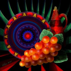
I haven't been on the site lately...as usual, it's a pleasure to be greeted by your exceptional work. The colors are great and the grapes are surreal in their perfect plumpness. But, again, it is the details that get to me: the texture on the vase, and the wear at the edges of the plate. Very Fine.
      |
I haven't been on the site lately...as usual, it's a pleasure to be greeted by your exceptional work. The colors are great and the grapes are surreal in their perfect plumpness. But, again, it is the details that get to me: the texture on the vase, and the wear at the edges of the plate. Very Fine.
Comment Written 15-Sep-2010
Comment from Robin Gillow
Well balanced and colourful,as always Shawn. This is a pleasing picture. Good technique and feel. The colour and composition too, work well. Robin
      |
Well balanced and colourful,as always Shawn. This is a pleasing picture. Good technique and feel. The colour and composition too, work well. Robin
Comment Written 15-Sep-2010
Comment from Nadege
Another colourful piece, I really like the composition with all the lovely lights reflecting on the grapes. The plate looks fantastic, another great artwork.
      |
Another colourful piece, I really like the composition with all the lovely lights reflecting on the grapes. The plate looks fantastic, another great artwork.
Comment Written 15-Sep-2010
Comment from Janmccri
Initial Impact-5
Creativity of Presentation-5
color harmony-5.5
Center of Interest-5
Technical Excellence-5
Technique-5
Story Telling Ability-5
Lighting-5
What beautiful colors and I like the 3-D effects. Great presentation which really attracts the viewer's eye.
      |
Initial Impact-5
Creativity of Presentation-5
color harmony-5.5
Center of Interest-5
Technical Excellence-5
Technique-5
Story Telling Ability-5
Lighting-5
What beautiful colors and I like the 3-D effects. Great presentation which really attracts the viewer's eye.
Comment Written 15-Sep-2010
Comment from azwoman112
Beautiful piece of work. The colors added beautiful enhancement to this. Reminds me of The Via de los Muertos
(Day of the Dead celebration with all the color here in the southwest. AZ
       |
Beautiful piece of work. The colors added beautiful enhancement to this. Reminds me of The Via de los Muertos
(Day of the Dead celebration with all the color here in the southwest. AZ
Comment Written 15-Sep-2010
Comment from Iowa
I really like this digital art. Like how you can see the light reflecting of the pieces. I really like the multi-colored plate! The grapes and cup add to the picture! Good Job!
      |
I really like this digital art. Like how you can see the light reflecting of the pieces. I really like the multi-colored plate! The grapes and cup add to the picture! Good Job!
Comment Written 14-Sep-2010
Comment from raineyknightartwork
Initial impact: Mexico
Creativity: stunning and challenging
Color Harmony: bright, bold, and outstanding choices
Center of Interest: red dot in the middle of the blue and the grapes
Technical Excellence: exceptional 6+ stars earned. Sorry I am out of these right now...
Technique: digital
Story Telling Ability: Mexico a place of old, Mexico a place to go....
Lighting: --
NOTICE TO ARTIST: I am a self taught Artist. I do not consider myself an expert; nor should you consider me one. I do write poetry. I have a sense of humor. I may have included either or both in this review. I use the following scale to determine star level. 6=Exceptional/Outstanding, 5.5=Professional level, 5=Expert, 4.5= Above Average, 4=Average, 3=Good Start, 2=Needs Work, 1=Poor. Your comments are greatly appreciated. Have a nice day?.Rainey.
      |
Initial impact: Mexico
Creativity: stunning and challenging
Color Harmony: bright, bold, and outstanding choices
Center of Interest: red dot in the middle of the blue and the grapes
Technical Excellence: exceptional 6+ stars earned. Sorry I am out of these right now...
Technique: digital
Story Telling Ability: Mexico a place of old, Mexico a place to go....
Lighting: --
NOTICE TO ARTIST: I am a self taught Artist. I do not consider myself an expert; nor should you consider me one. I do write poetry. I have a sense of humor. I may have included either or both in this review. I use the following scale to determine star level. 6=Exceptional/Outstanding, 5.5=Professional level, 5=Expert, 4.5= Above Average, 4=Average, 3=Good Start, 2=Needs Work, 1=Poor. Your comments are greatly appreciated. Have a nice day?.Rainey.
Comment Written 14-Sep-2010
Comment from diana_mascarenhas
I like it, it's very interestingm the colors here are so beautiful, perfect contrast, very moving, the bright reds are appealing and the overall composition has great impact, thank you, good work
      |
I like it, it's very interestingm the colors here are so beautiful, perfect contrast, very moving, the bright reds are appealing and the overall composition has great impact, thank you, good work
Comment Written 14-Sep-2010
Comment from virginian
Good title. Dark background pops out your subject. Very nice creation. Greenery is in good position. The colors are vibrant and crisp. Shadows and lighting very nice. 'Enjoyed.
      |
Good title. Dark background pops out your subject. Very nice creation. Greenery is in good position. The colors are vibrant and crisp. Shadows and lighting very nice. 'Enjoyed.
Comment Written 14-Sep-2010
