
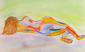
Ablaze with Dreams!
Conceptual painting17 total reviews
Comment from amfunny
Great job on this. It looks like she is sleeping on a cloud... just floating there. Nice colors and very cool looking.
reply by the author on 14-Aug-2012
  |
Great job on this. It looks like she is sleeping on a cloud... just floating there. Nice colors and very cool looking.
Comment Written 14-Aug-2012
reply by the author on 14-Aug-2012
-
Did't want the viewer's eyes to stray. Hence no background effect!Just simple soft colours-dream like! Thanks very much for your nice review and rating. I appreciate it.
Comment from Ryan53090
i really like the warm colors you chose to create this work of art. though i feel around the back it could be touched up a little.
reply by the author on 14-Aug-2012
  |
i really like the warm colors you chose to create this work of art. though i feel around the back it could be touched up a little.
Comment Written 14-Aug-2012
reply by the author on 14-Aug-2012
-
Point noted. I appreciate your nice review. Thank you so much for your support. Glad you liked it.
Comment from kbp painter
This is beautiful. I love the contrasting yellow and purple background too. You have perfect use of color always. I think that the environment and colorful cultural temples where you live have influenced you in a great way, as well as your intellectual studies.
reply by the author on 14-Aug-2012
|
This is beautiful. I love the contrasting yellow and purple background too. You have perfect use of color always. I think that the environment and colorful cultural temples where you live have influenced you in a great way, as well as your intellectual studies.
Comment Written 14-Aug-2012
reply by the author on 14-Aug-2012
-
May be.Subconsciously we absorb many things. I never went to any art school. I'm a autodidact! I am very glad you liked it. Thank you so much for the positive review and support. I really appreciate it.
Comment from Lucien van Oosten
I like the interpretation and the colors used on the human form for the most part. I do think that the hair needs less lines and more form and shapes. Like on the body. To me that are draws the eye away from the good flowing shapes that create the human form. Know what I mean? Every place else it flows, there it gets messy. To me lacks continuity with the rest of the work.
This rating does not count towards story rating or author rank.
The highest and the lowest rating are not included in calculations.
reply by the author on 14-Aug-2012
 |
I like the interpretation and the colors used on the human form for the most part. I do think that the hair needs less lines and more form and shapes. Like on the body. To me that are draws the eye away from the good flowing shapes that create the human form. Know what I mean? Every place else it flows, there it gets messy. To me lacks continuity with the rest of the work.
This rating does not count towards story rating or author rank.
The highest and the lowest rating are not included in calculations.
Comment Written 14-Aug-2012
reply by the author on 14-Aug-2012
-
Point noted for future works! Thank you so much for the positive review and support. I really appreciate it.
Comment from esgjag
Great work my friend. Another example of you incredible talents. Love your color combinations. This truly shows you versatility.
reply by the author on 14-Aug-2012
|
Great work my friend. Another example of you incredible talents. Love your color combinations. This truly shows you versatility.
Comment Written 14-Aug-2012
reply by the author on 14-Aug-2012
-
I am very glad you liked it. Thank you so much for the positive review and support. I really appreciate it.
Comment from MKFlood
this is poretty cool bro. love the choice of colors. the blend is great. the body form is great. nice blend on the background. overall great job.
reply by the author on 14-Aug-2012
|
this is poretty cool bro. love the choice of colors. the blend is great. the body form is great. nice blend on the background. overall great job.
Comment Written 14-Aug-2012
reply by the author on 14-Aug-2012
-
I appreciate your nice review. Thank you so much for your support. Glad you liked it.
Comment from cynnocence
My friend, this is another one that I like tremendously. It is much in the picasso style yet with softer curves and lines. I wish that you had not added the use of the software, there is so little actual traditional art out there these days. Cyn
reply by the author on 14-Aug-2012
|
My friend, this is another one that I like tremendously. It is much in the picasso style yet with softer curves and lines. I wish that you had not added the use of the software, there is so little actual traditional art out there these days. Cyn
Comment Written 14-Aug-2012
reply by the author on 14-Aug-2012
-
I used the software for the background and for smoothening the edges since the painting was of small size. But he figure and colours are entirely done in watercolours.I appreciate your nice review. Thank you so much for your support. Glad you liked it.