Misc. Works
Viewing comments for Page 27 "Prancer"Odds and Ends
31 total reviews
Comment from Jean A Cormier
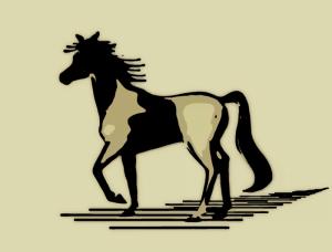
The initial impact is good. There is NO DOUBT this is a horse. I do like the silhoutted type of feel, and it is a very believable pose. The shading using lines is carried thru in his mane which is a pleasing touch! Jean
reply by the author on 01-Dec-2012
      |
The initial impact is good. There is NO DOUBT this is a horse. I do like the silhoutted type of feel, and it is a very believable pose. The shading using lines is carried thru in his mane which is a pleasing touch! Jean
Comment Written 28-Nov-2012
reply by the author on 01-Dec-2012
-
Thank you so very very much, Jean. :)shawn
Comment from WendyG
Lol, your notes are very funny Moonwillow! This is still a great work of art, love the 2D effect and the paint by number effect is wonderful. Excellent work of art!;)
reply by the author on 01-Dec-2012
      |
Lol, your notes are very funny Moonwillow! This is still a great work of art, love the 2D effect and the paint by number effect is wonderful. Excellent work of art!;)
Comment Written 28-Nov-2012
reply by the author on 01-Dec-2012
-
Thank you so very very much, Wendy. :)shawn
Comment from sohailanwar
Nice experimental digital art work with so fine sketch and good combination of colors,good art work with nice idea..
reply by the author on 01-Dec-2012
      |
Nice experimental digital art work with so fine sketch and good combination of colors,good art work with nice idea..
Comment Written 28-Nov-2012
reply by the author on 01-Dec-2012
-
Thank you so very very much, Sohail. :)shawn
Comment from marieann green
Very nicely done for a first try. I can, indeed , tell that it is a horse. Good technique used in creating this image.
reply by the author on 28-Nov-2012
      |
Very nicely done for a first try. I can, indeed , tell that it is a horse. Good technique used in creating this image.
Comment Written 28-Nov-2012
reply by the author on 28-Nov-2012
-
Thank you, Marie!! :)
Comment from amfunny
Well, I think you did a wonderful job on this. Not sure what all that is.. the software, etc.. but a great job.
reply by the author on 28-Nov-2012
      |
Well, I think you did a wonderful job on this. Not sure what all that is.. the software, etc.. but a great job.
Comment Written 28-Nov-2012
reply by the author on 28-Nov-2012
-
Thank you so much, Norma Jean!! :)
Comment from cynnocence
This is nice my friend. Often the more simple and austere, the more effective. Well composed and clear, the only thing I would change is the colour of the background. If I am correct (through all the technology) it is a cool gray and the internal ones are warm grays. Nice. Cyn
reply by the author on 28-Nov-2012
      |
This is nice my friend. Often the more simple and austere, the more effective. Well composed and clear, the only thing I would change is the colour of the background. If I am correct (through all the technology) it is a cool gray and the internal ones are warm grays. Nice. Cyn
Comment Written 27-Nov-2012
reply by the author on 28-Nov-2012
-
Thank you ever so much, Cyn. Unless my monitor is way off, the background is a very light biege. Hex #DCD9B0. Very close to the lightest color on the horse. Again, thank you!! :)shawn
Comment from ftbtaxman
This came out quite well. I like the simplicity of the work, but it does have a lot of depth. Thanks for sharing.
reply by the author on 28-Nov-2012
      |
This came out quite well. I like the simplicity of the work, but it does have a lot of depth. Thanks for sharing.
Comment Written 27-Nov-2012
reply by the author on 28-Nov-2012
-
Thank you so very very much, taxman!! :)shawn
Comment from Mara del Mar
A simple and creative piece. Very nice design and composition. I like the lines, that give perspective and depth to image. Very nice color and background. Good job.
Mara
reply by the author on 28-Nov-2012
      |
A simple and creative piece. Very nice design and composition. I like the lines, that give perspective and depth to image. Very nice color and background. Good job.
Mara
Comment Written 27-Nov-2012
reply by the author on 28-Nov-2012
-
Thank you, Mara!! :)shawn
Comment from sweetdweems
NICE. I am going to have to take the time to learn to do this. Like the composition, the contrast between black and white.
reply by the author on 28-Nov-2012
      |
NICE. I am going to have to take the time to learn to do this. Like the composition, the contrast between black and white.
Comment Written 27-Nov-2012
reply by the author on 28-Nov-2012
-
Thank you ever so much, sweetdweems!! :)shawn
Comment from Highfive
It does show creativity with nice shapes and forms in the dark and lights tones. I do get a deep sense of depth and perspective in your horse design which is very pleasant to view. Very nice design of a horse.
reply by the author on 28-Nov-2012
      |
It does show creativity with nice shapes and forms in the dark and lights tones. I do get a deep sense of depth and perspective in your horse design which is very pleasant to view. Very nice design of a horse.
Comment Written 27-Nov-2012
reply by the author on 28-Nov-2012
-
Thank you so very very much, Highfive!! :)shawn
