Expressive Mixed Media
Viewing comments for Page 31 "Celtic Quaich"Photos heavily altered
25 total reviews
Comment from Capture This
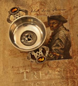
Very simple, yet very interesting topic here. Love what you did with the "bowl" and angle of the shot looking flat, yet slightly angles inside the bowl. Great details and focus!! Thanks for sharing.
reply by the author on 06-May-2014
      |
Very simple, yet very interesting topic here. Love what you did with the "bowl" and angle of the shot looking flat, yet slightly angles inside the bowl. Great details and focus!! Thanks for sharing.
Comment Written 01-May-2014
reply by the author on 06-May-2014
-
Thank you so very much for the lovely review
Comment from braided
Really nice the gold on Gold and the variant levels of that colour throughout
Nice composiiton
Nice colour harmony
Good clarity
Nice use of lighting
Good POV
Nice work
reply by the author on 06-May-2014
      |
Really nice the gold on Gold and the variant levels of that colour throughout
Nice composiiton
Nice colour harmony
Good clarity
Nice use of lighting
Good POV
Nice work
Comment Written 30-Apr-2014
reply by the author on 06-May-2014
-
Thank you so very much for the lovely review
-
My pleasure :-)
Comment from Jairos
Great Mixed media Work Again this is amazing, Great color harmony and very good sharp focus, good Camera techniques, Well done , -jairos
reply by the author on 06-May-2014
      |
Great Mixed media Work Again this is amazing, Great color harmony and very good sharp focus, good Camera techniques, Well done , -jairos
Comment Written 30-Apr-2014
reply by the author on 06-May-2014
-
Thank you so very much for the lovely review
Comment from willie
Nice work!
This is interesting. I really like the use of the book for a background. A good idea! I think for the still life contest that this would have served it well. I may use this idea in the future. You have a very good imagination!
reply by the author on 06-May-2014
      |
Nice work!
This is interesting. I really like the use of the book for a background. A good idea! I think for the still life contest that this would have served it well. I may use this idea in the future. You have a very good imagination!
Comment Written 30-Apr-2014
reply by the author on 06-May-2014
-
Thank you so very much for the lovely review
Comment from slhbowen
This is a great idea. The book behind it was a really good idea too. The colors really compliment each other well.
reply by the author on 06-May-2014
      |
This is a great idea. The book behind it was a really good idea too. The colors really compliment each other well.
Comment Written 30-Apr-2014
reply by the author on 06-May-2014
-
Thank you so very much for the lovely review
Comment from Doris1022
nice work, the cup fits it well. have a good day.
what do you do with the cup? a decoration only?
or an ash tray?
reply by the author on 06-May-2014
      |
nice work, the cup fits it well. have a good day.
what do you do with the cup? a decoration only?
or an ash tray?
Comment Written 30-Apr-2014
reply by the author on 06-May-2014
-
Thank you so very much for the lovely review
Comment from gidavidson
Like the background, it works well subject. Very good exposure, focus and frame all for an interesting scene. Like it.
reply by the author on 06-May-2014
      |
Like the background, it works well subject. Very good exposure, focus and frame all for an interesting scene. Like it.
Comment Written 30-Apr-2014
reply by the author on 06-May-2014
-
Thank you so very much for the lovely review
Comment from wombio
Rather a nice image , nice colouring that works well with the silver quaich. The Cairngorm stones on the handles add a nice touch to the overall tones of sepia from the background picture of Treasure Island. Good angle of the quaich giving more shape. Good picture.
reply by the author on 06-May-2014
      |
Rather a nice image , nice colouring that works well with the silver quaich. The Cairngorm stones on the handles add a nice touch to the overall tones of sepia from the background picture of Treasure Island. Good angle of the quaich giving more shape. Good picture.
Comment Written 30-Apr-2014
reply by the author on 06-May-2014
-
Thank you so very much for the lovely review
-
Your welcome.
Comment from photocape
Interesting shot.The Framing is good and the depth is in focus.I see three subjects in this which adds variety also.
This rating does not count towards story rating or author rank.
The highest and the lowest rating are not included in calculations.
reply by the author on 06-May-2014
        |
Interesting shot.The Framing is good and the depth is in focus.I see three subjects in this which adds variety also.
This rating does not count towards story rating or author rank.
The highest and the lowest rating are not included in calculations.
Comment Written 30-Apr-2014
reply by the author on 06-May-2014
-
Thank you so very much for the lovely review and also for the very generous rating
Comment from Solway Lady
Makes an interesting image, the two subjects combine well together,well composed and the colors compliment the old world feel it has created. Really tells a story.
reply by the author on 06-May-2014
      |
Makes an interesting image, the two subjects combine well together,well composed and the colors compliment the old world feel it has created. Really tells a story.
Comment Written 30-Apr-2014
reply by the author on 06-May-2014
-
Thank you so very much for the lovely review
