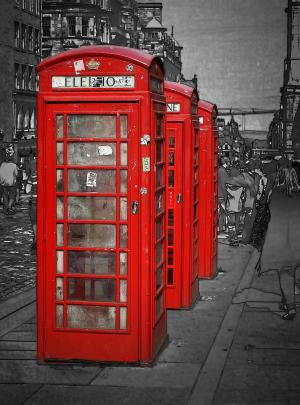
Red Telephone Boxes
Edinburgh18 total reviews
Comment from Lilibug6
This is very nice! I haven't seen any of these here for many years! The selective coloring looks great :) This should be a great entry for the contest! The lighting and presentation are very good! The focus is great! Well done and best of luck with the contest! Lilibug6
reply by the author on 29-Dec-2015
      |
This is very nice! I haven't seen any of these here for many years! The selective coloring looks great :) This should be a great entry for the contest! The lighting and presentation are very good! The focus is great! Well done and best of luck with the contest! Lilibug6
Comment Written 22-Dec-2015
reply by the author on 29-Dec-2015
-
Thank you so very much for the lovely review
-
You are welcome! Lori
Comment from a.samathasena
What a great nice gorgeous lovely mixed media shot.Wonderful nice scene and entrance.The Color red,telephone boxes and color red design and decoration,black and white b/g are gorgeous great and make a nice scene.I like this talent work and scene.Focus color and all are excellent.Great job.Well Done.Thanks.
reply by the author on 29-Dec-2015
      |
What a great nice gorgeous lovely mixed media shot.Wonderful nice scene and entrance.The Color red,telephone boxes and color red design and decoration,black and white b/g are gorgeous great and make a nice scene.I like this talent work and scene.Focus color and all are excellent.Great job.Well Done.Thanks.
Comment Written 22-Dec-2015
reply by the author on 29-Dec-2015
-
Thank you so very much for the lovely review
Comment from Alveria
Very cool image with creative post production work. The red telephone booths pop against the black and white surroundings. Excellent clarity with great visual impact. Fantastic contest entry. Good luck. ~Alveria
reply by the author on 29-Dec-2015
      |
Very cool image with creative post production work. The red telephone booths pop against the black and white surroundings. Excellent clarity with great visual impact. Fantastic contest entry. Good luck. ~Alveria
Comment Written 21-Dec-2015
reply by the author on 29-Dec-2015
-
Thank you so very much for the lovely review
Comment from liseworks
ok if they would have been blue they would have been Dr Who's Tardis. Lovely photo for the contest. Love that the background is black and white. Really well done, 3 is really nice to have for balance. Great photo
reply by the author on 29-Dec-2015
      |
ok if they would have been blue they would have been Dr Who's Tardis. Lovely photo for the contest. Love that the background is black and white. Really well done, 3 is really nice to have for balance. Great photo
Comment Written 21-Dec-2015
reply by the author on 29-Dec-2015
-
Thank you so very much for the lovely review
Comment from Joelgraphuchin
Initial impact: what An idea...!
Creativity of presentation: the reds are rally catching eyes.
Color Harmony: eye-pleasing contrast
Center of Interest: the boxes are sharp and clean. Great focus for sure.
Technical Excellence: rendition works well to present the Reds as the story to tell.
Well done and thanks for sharing.
reply by the author on 29-Dec-2015
      |
Initial impact: what An idea...!
Creativity of presentation: the reds are rally catching eyes.
Color Harmony: eye-pleasing contrast
Center of Interest: the boxes are sharp and clean. Great focus for sure.
Technical Excellence: rendition works well to present the Reds as the story to tell.
Well done and thanks for sharing.
Comment Written 21-Dec-2015
reply by the author on 29-Dec-2015
-
Thank you so very much for the lovely review
Comment from RachelS135
Very nice photograph! I love the vibrant red you selected to stand out from the filtered background. Excellent perspective creating depth; nice focus and detail; the telephone booths really stand out. Best of luck in the contest!
This rating does not count towards story rating or author rank.
The highest and the lowest rating are not included in calculations.
reply by the author on 29-Dec-2015
       |
Very nice photograph! I love the vibrant red you selected to stand out from the filtered background. Excellent perspective creating depth; nice focus and detail; the telephone booths really stand out. Best of luck in the contest!
This rating does not count towards story rating or author rank.
The highest and the lowest rating are not included in calculations.
Comment Written 21-Dec-2015
reply by the author on 29-Dec-2015
-
Thank you so very much for the lovely review
Comment from Dick Lee Shia
Aptly created for the contest theme.
Good selective color technique...
Diminishing perspective.
Vanishing viewpoint...
Impressive mixed media rendition.
Thanks and Happy Holidays!
reply by the author on 29-Dec-2015
      |
Aptly created for the contest theme.
Good selective color technique...
Diminishing perspective.
Vanishing viewpoint...
Impressive mixed media rendition.
Thanks and Happy Holidays!
Comment Written 21-Dec-2015
reply by the author on 29-Dec-2015
-
Thank you so very much for the lovely review
Comment from michiganmike
An eye catching shot with a fine treatment on the buildings in the background. The selective color is very good and should serve you well in the contest. Best of luck in the voting.
This rating does not count towards story rating or author rank.
The highest and the lowest rating are not included in calculations.
reply by the author on 29-Dec-2015
      |
An eye catching shot with a fine treatment on the buildings in the background. The selective color is very good and should serve you well in the contest. Best of luck in the voting.
This rating does not count towards story rating or author rank.
The highest and the lowest rating are not included in calculations.
Comment Written 21-Dec-2015
reply by the author on 29-Dec-2015
-
Thank you so very much for the lovely review
