Misc. Works
Viewing comments for Page 19 "Afrachnophobia"Odds and Ends
25 total reviews
Comment from jgrace
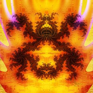
Nice fractal design. Interesting pattern in the background. Very unusual. Almost has an asian appearance. Good color. Good focus and lighting within the piece is done well.
reply by the author on 26-Sep-2008
      |
Nice fractal design. Interesting pattern in the background. Very unusual. Almost has an asian appearance. Good color. Good focus and lighting within the piece is done well.
Comment Written 26-Sep-2008
reply by the author on 26-Sep-2008
-
Thank you very much, Julie! And that settles it...I'm never going to visit any Asian countries! lol.
Comment from nykolas
i have to say every new digital artwork isee from you , every time it's better and better.. i like very much the blend of the colors and the all idea around the title and the resolt
reply by the author on 26-Sep-2008
      |
i have to say every new digital artwork isee from you , every time it's better and better.. i like very much the blend of the colors and the all idea around the title and the resolt
Comment Written 26-Sep-2008
reply by the author on 26-Sep-2008
-
Thank you very much, Nykolas!
Comment from For Luv of Art /!!!/
Shawn this is a beautiful piece of work. Very warm and enticing with a hidden image of a spider. The colors flow off the page. I like the texture you created in the backgrond. The pink highlights glow like neon. It's a good composed piece. Excellent.
reply by the author on 26-Sep-2008
      |
Shawn this is a beautiful piece of work. Very warm and enticing with a hidden image of a spider. The colors flow off the page. I like the texture you created in the backgrond. The pink highlights glow like neon. It's a good composed piece. Excellent.
Comment Written 26-Sep-2008
reply by the author on 26-Sep-2008
-
Thank you for the wonderful comments and rating, 4LA!
Comment from StRyCh9
Your titling works so well to set this piece off! I really like your superb use of color for impact and admire the awesome danger created by the colors heat! Your wonderful use of shades gives this work a fabulous depth! A great pleasure to be able to view another one of your works:)
This rating does not count towards story rating or author rank.
The highest and the lowest rating are not included in calculations.
reply by the author on 26-Sep-2008
      |
Your titling works so well to set this piece off! I really like your superb use of color for impact and admire the awesome danger created by the colors heat! Your wonderful use of shades gives this work a fabulous depth! A great pleasure to be able to view another one of your works:)
This rating does not count towards story rating or author rank.
The highest and the lowest rating are not included in calculations.
Comment Written 26-Sep-2008
reply by the author on 26-Sep-2008
-
Bet you don't have anything that looks like this there :) If I say something like this creeping around the jungle, I would quickly move to a remote area of Alaska or somewhere. Thank you, StRy!!
-
lol, you are so right!... Besides if there was it would get eaten by our scorpions that eat the other eight leggers:)
Comment from A-one
Impact 4
Creativity 5
Color 4
Content 4
Technique 5
Composition 5
Additional Comments: Very creative image. Nicely effected and well done design.
Suggestions: colors seem to clash a bit. Not enough depth to hold intrest for long.
This rating does not count towards story rating or author rank.
The highest and the lowest rating are not included in calculations.
reply by the author on 27-Sep-2008
       |
Impact 4
Creativity 5
Color 4
Content 4
Technique 5
Composition 5
Additional Comments: Very creative image. Nicely effected and well done design.
Suggestions: colors seem to clash a bit. Not enough depth to hold intrest for long.
This rating does not count towards story rating or author rank.
The highest and the lowest rating are not included in calculations.
Comment Written 26-Sep-2008
reply by the author on 27-Sep-2008
-
Thank you, Shar-on!!
