
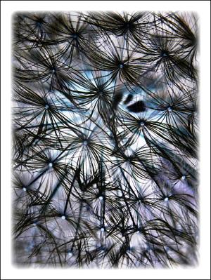
Inverted Beauty
Close up of dandelion seeds32 total reviews
Comment from Lynnmarie
What a clever idea! Love the pattern the inverted photo makes. Nice dark shapes against the light background. You can see the detail better because of the contrast. Nice work! Lynnmarie
reply by the author on 15-Jun-2011
  |
What a clever idea! Love the pattern the inverted photo makes. Nice dark shapes against the light background. You can see the detail better because of the contrast. Nice work! Lynnmarie
Comment Written 15-Jun-2011
reply by the author on 15-Jun-2011
-
Thank you very much
Comment from bluegypsyrose
This is very beautiful. I also love the colors. I like the framing and the textures are very soft looking. Thank you for sharing.
reply by the author on 15-Jun-2011
|
This is very beautiful. I also love the colors. I like the framing and the textures are very soft looking. Thank you for sharing.
Comment Written 15-Jun-2011
reply by the author on 15-Jun-2011
-
Thank you very much
Comment from seshadri_sreenivasan
Yes. I liked the original. It had a delicate and soft finish. One could feel the fluffy white ones flying. This one looks comparatively harsh on the eyes. But the light and shadow looks interesting.
reply by the author on 15-Jun-2011
  |
Yes. I liked the original. It had a delicate and soft finish. One could feel the fluffy white ones flying. This one looks comparatively harsh on the eyes. But the light and shadow looks interesting.
Comment Written 15-Jun-2011
reply by the author on 15-Jun-2011
-
Thank you very much
Comment from marieann green
I like it. What a fabulous design for a fabric. So unique and interesting. Both images are quite amazing. A pleasure to review
reply by the author on 15-Jun-2011
|
I like it. What a fabulous design for a fabric. So unique and interesting. Both images are quite amazing. A pleasure to review
Comment Written 15-Jun-2011
reply by the author on 15-Jun-2011
-
Thank you very much
Comment from PoohBear
This is nice and I must say, different, however, different is not always better. This photo does show that you were thinking and that's the important part.
reply by the author on 15-Jun-2011
|
This is nice and I must say, different, however, different is not always better. This photo does show that you were thinking and that's the important part.
Comment Written 15-Jun-2011
reply by the author on 15-Jun-2011
-
Thank you very much
Comment from canon shooter
You are right that this sure looks different, but very interesting. I am one of those that like the fist one best. With this one I think the three black dots on the right side is a little distracting.
reply by the author on 15-Jun-2011
|
You are right that this sure looks different, but very interesting. I am one of those that like the fist one best. With this one I think the three black dots on the right side is a little distracting.
Comment Written 15-Jun-2011
reply by the author on 15-Jun-2011
-
Thank you very much
Comment from Shakeadog
yes I liked the original better
but its good to experiment
the patterns appear differently
i do like the dark lines
well shot
good focus
reply by the author on 15-Jun-2011
|
yes I liked the original better
but its good to experiment
the patterns appear differently
i do like the dark lines
well shot
good focus
Comment Written 15-Jun-2011
reply by the author on 15-Jun-2011
-
Thank you very much
Comment from sarah63
Great photograph.
This does look like a great abstract, with good colors and tones in it I must say i like this as much as the original so great work and many thanks for sharing your experiment.
reply by the author on 15-Jun-2011
|
Great photograph.
This does look like a great abstract, with good colors and tones in it I must say i like this as much as the original so great work and many thanks for sharing your experiment.
Comment Written 15-Jun-2011
reply by the author on 15-Jun-2011
-
Thank you very much
-
Your very Welcome.
Comment from Lucien van Oosten
I think the image has a very nice abstract effect where the lines of the plant and the negative areas are all working together to create a interesting composition, of textures and space. I like all aspects of the altered image but the faded out edges, I think it draws the eye away from the nice flow going on within the image and as I'm seeing it is not needed because it competes with the fade out blues and change the depth and perspective there.
reply by the author on 15-Jun-2011
|
I think the image has a very nice abstract effect where the lines of the plant and the negative areas are all working together to create a interesting composition, of textures and space. I like all aspects of the altered image but the faded out edges, I think it draws the eye away from the nice flow going on within the image and as I'm seeing it is not needed because it competes with the fade out blues and change the depth and perspective there.
Comment Written 15-Jun-2011
reply by the author on 15-Jun-2011
-
Thank you very much. Glad you liked it. It is easy to change the fading. Actually have another without it.
Comment from amfunny
I actually like this one better.
It has more contrast and character.
Very creatively done.
The hint of blue works well.
reply by the author on 15-Jun-2011
|
I actually like this one better.
It has more contrast and character.
Very creatively done.
The hint of blue works well.
Comment Written 15-Jun-2011
reply by the author on 15-Jun-2011
-
There you go. Somebody just told me they liked better the original. I of course knew that would happen. Personally I like them both. Thank you very much for the nice review, and I am glad you like the abstract.