Misc. Works
Viewing comments for Page 15 "Abstract for Guys"Odds and Ends
43 total reviews
Comment from Skyangel02
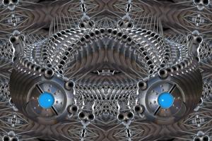
I am not usually a fan of abstract but this one has interesting lines, patterns, shapes and texture. It also has great reflective light which makes the metal effect look realistically metallic. It makes me think of engine parts or could easily be seen as a space ship with blue lights. I think it is excellent.
      |
I am not usually a fan of abstract but this one has interesting lines, patterns, shapes and texture. It also has great reflective light which makes the metal effect look realistically metallic. It makes me think of engine parts or could easily be seen as a space ship with blue lights. I think it is excellent.
Comment Written 21-Nov-2012
Comment from Glen Spey
This kind of looks like a space ship. I'm not really into abstract art and I usually pass right by it but I thought this was kind of cool, maybe it's the blue that caught my eye.
Nice work!
      |
This kind of looks like a space ship. I'm not really into abstract art and I usually pass right by it but I thought this was kind of cool, maybe it's the blue that caught my eye.
Nice work!
Comment Written 21-Nov-2012
Comment from GaliaG
it is ok on my monitor
the light seems to come from the back of the piece and the metal colors are really cool and lovely
thanks for sharing
      |
it is ok on my monitor
the light seems to come from the back of the piece and the metal colors are really cool and lovely
thanks for sharing
Comment Written 21-Nov-2012
Comment from the rhatzz
Very fine detail here a excelent job. Also very intricate as well. and is toped of by the 2 aqua parts that could be eyes. all round good job :-)
      |
Very fine detail here a excelent job. Also very intricate as well. and is toped of by the 2 aqua parts that could be eyes. all round good job :-)
Comment Written 21-Nov-2012
Comment from khristysdesigns
you are so right, I think it reminds me of the matricts. I like the designs and the blue it adds color, gives it depth. nicely done.
      |
you are so right, I think it reminds me of the matricts. I like the designs and the blue it adds color, gives it depth. nicely done.
Comment Written 20-Nov-2012
Comment from donkeyoatey
It isn't overly dark here. Sort of a metallic dream bracelet? The more I lok, the more detail I notice in theis, and the more detail, the more depth! I have NO idea how you do this, but I like it! Donkeyoatey
      |
It isn't overly dark here. Sort of a metallic dream bracelet? The more I lok, the more detail I notice in theis, and the more detail, the more depth! I have NO idea how you do this, but I like it! Donkeyoatey
Comment Written 20-Nov-2012
Comment from jesuel
What an amazing piece of art the color composition is perfect the design is very creative love the blue great addition another great work of art fine job here
      |
What an amazing piece of art the color composition is perfect the design is very creative love the blue great addition another great work of art fine job here
Comment Written 20-Nov-2012
Comment from Jean A Cormier
THis is a dramatic piece and reminded me at forst of a turquoise and silver bracelet, but then it looked like blue headlights coming right out of the screen. This digital piece looks like a cover to a coporate report -that is meant as a compliment! Jean
      |
THis is a dramatic piece and reminded me at forst of a turquoise and silver bracelet, but then it looked like blue headlights coming right out of the screen. This digital piece looks like a cover to a coporate report -that is meant as a compliment! Jean
Comment Written 20-Nov-2012
Comment from redonion
This is way too cool. Fantastic concept in design.Love the colors especially the blue. Really nice with the silver look.The blue really pops and adds alot to this picture. Wonderful!
      |
This is way too cool. Fantastic concept in design.Love the colors especially the blue. Really nice with the silver look.The blue really pops and adds alot to this picture. Wonderful!
Comment Written 20-Nov-2012
Comment from filly421
I'm not particularly into machinery, but I think the design is fantastic.
It's very intricate, but its symmetry and organization keep it from being overwhelming.
Lots of repeated shapes give it rhythm.
Lots of smoothness, with some interesting texture for contrast.
Good central placement.
Good amount of light.
Like the two turqoise blue "eyes" next to all the silver.
great design.
      |
I'm not particularly into machinery, but I think the design is fantastic.
It's very intricate, but its symmetry and organization keep it from being overwhelming.
Lots of repeated shapes give it rhythm.
Lots of smoothness, with some interesting texture for contrast.
Good central placement.
Good amount of light.
Like the two turqoise blue "eyes" next to all the silver.
great design.
Comment Written 20-Nov-2012
