Misc. Works
Viewing comments for Page 13 "A Touch of Old Mexico"Odds and Ends
56 total reviews
Comment from sandyapple
A lovely image indeed full of colour and zest. Well composed arrangement showing a good eye . Artistically very good style .Very good initial impact which then holds the interest of the viewer
well done indeed
      |
A lovely image indeed full of colour and zest. Well composed arrangement showing a good eye . Artistically very good style .Very good initial impact which then holds the interest of the viewer
well done indeed
Comment Written 14-Sep-2010
Comment from Nature Gal
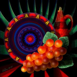
Bright beautiful colors. Many different shapes of the indigenous people, circles, triangle. Good composition. I like the little drops of water on the fruit. Also the Mexican influence.
      |
Bright beautiful colors. Many different shapes of the indigenous people, circles, triangle. Good composition. I like the little drops of water on the fruit. Also the Mexican influence.
Comment Written 14-Sep-2010
Comment from Wolfdancer
Stunning piece of art. I love the multitude of colours here. Its very Spanish with the design and the crockery. Well done!
      |
Stunning piece of art. I love the multitude of colours here. Its very Spanish with the design and the crockery. Well done!
Comment Written 14-Sep-2010
Comment from cmoisel
What a vibrant piece of art
Love the whole composition
Good colour contrast here
Love the design and the patterns formed
Very eye catching
Thanks for sharing
      |
What a vibrant piece of art
Love the whole composition
Good colour contrast here
Love the design and the patterns formed
Very eye catching
Thanks for sharing
Comment Written 14-Sep-2010
Comment from stanjo
This looks beautiful I love all the bright colors on this, it certainly has a Mexican look to it, good impact and story telling ability thanks for sharing!!
      |
This looks beautiful I love all the bright colors on this, it certainly has a Mexican look to it, good impact and story telling ability thanks for sharing!!
Comment Written 14-Sep-2010
Comment from GaliaG
amazing piece with amazing colors, light and composition
love the water drops on the grapes and the way you have done the shadows
an amazing piece, thansk for shairng
        |
amazing piece with amazing colors, light and composition
love the water drops on the grapes and the way you have done the shadows
an amazing piece, thansk for shairng
Comment Written 14-Sep-2010
Comment from just_me_ilse
Hello,
Wow, full of color shape and repetition.
The glow from what appears to be a type of berry really captures the eye and overall composition is good. :D Nice job! :D
This rating does not count towards story rating or author rank.
The highest and the lowest rating are not included in calculations.
       |
Hello,
Wow, full of color shape and repetition.
The glow from what appears to be a type of berry really captures the eye and overall composition is good. :D Nice job! :D
This rating does not count towards story rating or author rank.
The highest and the lowest rating are not included in calculations.
Comment Written 14-Sep-2010
Comment from vipshehan-Nikon
Nice creative work here with good initial impact and nice detail. The color tones look great and the piece holds the attention of the viewer.
Thanks for sharing.
      |
Nice creative work here with good initial impact and nice detail. The color tones look great and the piece holds the attention of the viewer.
Thanks for sharing.
Comment Written 14-Sep-2010
Comment from paulinejjones
What grabs me about this one is the grapes; you have the light and shadows in the right place, lovely translucent colors, which add real depth and beautiful water droplets. The only way I could think of to improve them is to make the shapes and sizes a tiny bit irregular, just to add realism; but that is your decision.
      |
What grabs me about this one is the grapes; you have the light and shadows in the right place, lovely translucent colors, which add real depth and beautiful water droplets. The only way I could think of to improve them is to make the shapes and sizes a tiny bit irregular, just to add realism; but that is your decision.
Comment Written 14-Sep-2010
Comment from RevDon
Initial impact is wow, what vibrant colors and in nice harmony with each other. This is a very creative presentation. There really is not center of interest here and that works very well. It causes the eye to roam from one object to the next and then coming back to the over all art. The black background definitely helps push your composition forward towards us. Somehow you also got depth with the size of your objects. You have demonstrated good technical excellence and technique for us. Nice Job.
        |
Initial impact is wow, what vibrant colors and in nice harmony with each other. This is a very creative presentation. There really is not center of interest here and that works very well. It causes the eye to roam from one object to the next and then coming back to the over all art. The black background definitely helps push your composition forward towards us. Somehow you also got depth with the size of your objects. You have demonstrated good technical excellence and technique for us. Nice Job.
Comment Written 14-Sep-2010
