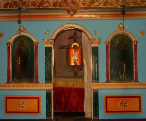
Beauty
Small church in Mani53 total reviews
Comment from marieann green
Annie, so beautiful and touching. Colors are lovely and harmonious. The shot is, however, not straight. Easily fixed. Good story telling. Nicely composed.
Enjoyed
reply by the author on 09-Nov-2010
      |
Annie, so beautiful and touching. Colors are lovely and harmonious. The shot is, however, not straight. Easily fixed. Good story telling. Nicely composed.
Enjoyed
Comment Written 08-Nov-2010
reply by the author on 09-Nov-2010
-
Thank you very much
Comment from vipshehan-Nikon
Nice image with good story telling ability. The detail is nice and he color tones look great too.
Thanks for sharing and I enjoyed it.
reply by the author on 09-Nov-2010
      |
Nice image with good story telling ability. The detail is nice and he color tones look great too.
Thanks for sharing and I enjoyed it.
Comment Written 08-Nov-2010
reply by the author on 09-Nov-2010
-
Thank you very much
Comment from littletree
Very pretty picture. Nice colors and the altar with Jesus is beautifully alight. I love the ornate woodwork and decoration. Thanks for sharing!
reply by the author on 09-Nov-2010
       |
Very pretty picture. Nice colors and the altar with Jesus is beautifully alight. I love the ornate woodwork and decoration. Thanks for sharing!
Comment Written 08-Nov-2010
reply by the author on 09-Nov-2010
-
Thank you very much
Comment from PipesLine
Like the framing and balance. However the focus is not a strong point in my opinion. Maybe since you really did not like taking the picture you got in a hurry. Thanks for sharing, John
reply by the author on 09-Nov-2010
      |
Like the framing and balance. However the focus is not a strong point in my opinion. Maybe since you really did not like taking the picture you got in a hurry. Thanks for sharing, John
Comment Written 08-Nov-2010
reply by the author on 09-Nov-2010
-
Thank you very much
Comment from flower29
Nice color in this photo and I the light and shadow really works here because the saints are darker and more obscured while the central figure of Christ is brightly lit. I'm glad you decided to take the picture:)
reply by the author on 08-Nov-2010
       |
Nice color in this photo and I the light and shadow really works here because the saints are darker and more obscured while the central figure of Christ is brightly lit. I'm glad you decided to take the picture:)
Comment Written 08-Nov-2010
reply by the author on 08-Nov-2010
-
Thank you very much
Comment from benkolo
Good colours and lighting worked well. Composed and presented well showing again great technical ability and technique. Focus is pin sharp showing all the lovely detail, it has a lovely centre of interest, overall very good.
reply by the author on 08-Nov-2010
      |
Good colours and lighting worked well. Composed and presented well showing again great technical ability and technique. Focus is pin sharp showing all the lovely detail, it has a lovely centre of interest, overall very good.
Comment Written 08-Nov-2010
reply by the author on 08-Nov-2010
-
Thank you very much
-
You're very welcome
Comment from Daliant
I'm not sure about this. The details around the the body on the cross are a little washed out along with the cloth underneath. You have framed it well but could have straightened the horizontal lines . Love the colour on the walls and you have done a great job capturing these colours.
reply by the author on 08-Nov-2010
      |
I'm not sure about this. The details around the the body on the cross are a little washed out along with the cloth underneath. You have framed it well but could have straightened the horizontal lines . Love the colour on the walls and you have done a great job capturing these colours.
Comment Written 08-Nov-2010
reply by the author on 08-Nov-2010
-
Thank you very much
Comment from LarryB
A good story to tell. The shot has little detail, and the cross in the center is cut off.
Sorry you are not a beleiver, but that is your choice.
Thanks for sharing, a nice try.
reply by the author on 08-Nov-2010
       |
A good story to tell. The shot has little detail, and the cross in the center is cut off.
Sorry you are not a beleiver, but that is your choice.
Thanks for sharing, a nice try.
Comment Written 08-Nov-2010
reply by the author on 08-Nov-2010
-
Thank you very much
Comment from MinoYasue
The out all outcomes is quite dignified. I think the color of gold and lighting effect on that creates this effect. It has wonderful composition that shows skilled craftsmanship of this artwork. Pleased to see and thank you for sharing.
reply by the author on 08-Nov-2010
      |
The out all outcomes is quite dignified. I think the color of gold and lighting effect on that creates this effect. It has wonderful composition that shows skilled craftsmanship of this artwork. Pleased to see and thank you for sharing.
Comment Written 08-Nov-2010
reply by the author on 08-Nov-2010
-
Thank you very much
Comment from dodgement
Initial Impact.
Texture.
Lighting.
Technique.
Colours.
Composition.
Framing.
Originality.
Light & shading.
Story Telling.
Dificulty Of Shot.
In my Humble opinion I am awarding 4.5 stars. Bit tilted, The top looks more interesting that the orange squares.
reply by the author on 08-Nov-2010
       |
Initial Impact.
Texture.
Lighting.
Technique.
Colours.
Composition.
Framing.
Originality.
Light & shading.
Story Telling.
Dificulty Of Shot.
In my Humble opinion I am awarding 4.5 stars. Bit tilted, The top looks more interesting that the orange squares.
Comment Written 08-Nov-2010
reply by the author on 08-Nov-2010
-
Thank you very much
