Comment from
mikecunniff
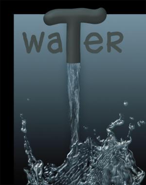
The letters take away from the image, only because of the free hand style writing and in turn takes away, if this was created using a font in photoshop that might have granted a 5 stars instead of 4...
Comment Written 07-Jan-2011
reply by the author on 07-Jan-2011
Thanks for your comments, but this choice of font is, for me, an important part of this creation. I choose this font precisely because of its look. It is part of the picture and represent nature, the T being the source of water and evoking also a tap.
reply by the author on 08-Jan-2011
P.S. Your comment helped me to complete my notes :)
Comment from
SilkAngel
Very creative use of Photoshop. I like the way the water curls and waves in the picture. I don't know what you could do to enhance this photo. It is very nicely done.
Comment Written 07-Jan-2011
reply by the author on 07-Jan-2011
Thank you so much for your nice review. I am glad you liked this image.


