Misc. Works
Viewing comments for Page 17 "Abstraction Attraction"Odds and Ends
35 total reviews
Comment from HappyPenguins
This is a really neat image, I love the way this was put together, it's really mind blowing just looking at it.
I'm normally not into abstract art but this one really does have a great appeal.
Excellent work of art, was a pleasure viewing!
-HP-
      |
This is a really neat image, I love the way this was put together, it's really mind blowing just looking at it.
I'm normally not into abstract art but this one really does have a great appeal.
Excellent work of art, was a pleasure viewing!
-HP-
Comment Written 21-Jul-2009
Comment from anniepage
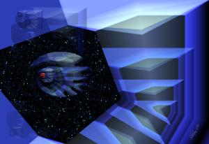
No dead space, good use of shapres and structure.
Color choices good, and movement to the front is well shown.
Everything is proportionate from the center to the front, good show of movement.
      |
No dead space, good use of shapres and structure.
Color choices good, and movement to the front is well shown.
Everything is proportionate from the center to the front, good show of movement.
Comment Written 21-Jul-2009
Comment from KarenMartin
This is very good work. I love the colours and how they all fit together, with just that little bit of red! Great shapes that are sharp and clear.
Thank you for sharing.
      |
This is very good work. I love the colours and how they all fit together, with just that little bit of red! Great shapes that are sharp and clear.
Thank you for sharing.
Comment Written 21-Jul-2009
Comment from focaldot
It sure is a very attractive piece of digital art :P this eye is attracting me :P if its eye lol. I like the shades of blue with lovely play of light and shadows. Well done.
reply by the author on 21-Jul-2009
      |
It sure is a very attractive piece of digital art :P this eye is attracting me :P if its eye lol. I like the shades of blue with lovely play of light and shadows. Well done.
Comment Written 21-Jul-2009
reply by the author on 21-Jul-2009
-
Thank you very very much, Surmed!! :)
Comment from TimeSnatcher
Very very cool. I like the depth you've achieved and the monochrome blue.
The shapes all work together as well.
This is a very nice composition with lots to look at and a pleasing presentation.
      |
Very very cool. I like the depth you've achieved and the monochrome blue.
The shapes all work together as well.
This is a very nice composition with lots to look at and a pleasing presentation.
Comment Written 20-Jul-2009
Comment from AlienVoyager
cool color choice for cool concept.
I can feel my self being in the big space, viewing the galaxy from this 'eye' (well, 'window') you provided here.
Very nice composition and effects.
I love how you blend the simple abstract-like lines on the right with those tiny complicated dots on the left, together they make a totally new story!
      |
cool color choice for cool concept.
I can feel my self being in the big space, viewing the galaxy from this 'eye' (well, 'window') you provided here.
Very nice composition and effects.
I love how you blend the simple abstract-like lines on the right with those tiny complicated dots on the left, together they make a totally new story!
Comment Written 20-Jul-2009
Comment from jesuel
thats just cool the color composition is fantastic as well as the design great depth as well fantastic lighting it gives it extra dimension beautiful work here
      |
thats just cool the color composition is fantastic as well as the design great depth as well fantastic lighting it gives it extra dimension beautiful work here
Comment Written 20-Jul-2009
Comment from luvsGod
This is a wonderful work of art. It makes you want to continue to look at it, and just enjoy what you see. I love the blues, the shapes and the whole concept. Great initial impact, color harmony and story telling ability.
      |
This is a wonderful work of art. It makes you want to continue to look at it, and just enjoy what you see. I love the blues, the shapes and the whole concept. Great initial impact, color harmony and story telling ability.
Comment Written 19-Jul-2009
Comment from Molly Hungar
This looks really great I love the colours and the nice clean lines It has great initial impact and it holds your attention as you want to study it more I really like it alot
      |
This looks really great I love the colours and the nice clean lines It has great initial impact and it holds your attention as you want to study it more I really like it alot
Comment Written 19-Jul-2009
Comment from heart4art
I LIKE THE COLORING YOU CHOSE TO USE IN THIS PIECE. I ESPECIALLY LIKE THE GALAXY OF STARS. IS THAT A SPACE SHIP OR SOMETHING ELSE. I AM NOT VERY GOOD WITH ABSTRACTS.
SORRY BUT THANKS FOR SHARING
EILEEN
       |
I LIKE THE COLORING YOU CHOSE TO USE IN THIS PIECE. I ESPECIALLY LIKE THE GALAXY OF STARS. IS THAT A SPACE SHIP OR SOMETHING ELSE. I AM NOT VERY GOOD WITH ABSTRACTS.
SORRY BUT THANKS FOR SHARING
EILEEN
Comment Written 19-Jul-2009
