Misc. Works
Viewing comments for Page 31 "Twister II"Odds and Ends
24 total reviews
Comment from nonarom
Very elegant design; I like how neat and aesthetic is such an image; I always admired the fractal art, but I have no idea how to work on it; I'd love to, one day, so could you tell me please where should I begin with?
Thank you very much,
Nona
      |
Very elegant design; I like how neat and aesthetic is such an image; I always admired the fractal art, but I have no idea how to work on it; I'd love to, one day, so could you tell me please where should I begin with?
Thank you very much,
Nona
Comment Written 15-Jan-2011
Comment from Sandra c. valentini
realy like the black and white intricate design. composition 5 color choice 5 drama 5 intenseity 5
      |
realy like the black and white intricate design. composition 5 color choice 5 drama 5 intenseity 5
Comment Written 13-Jan-2011
Comment from catmal
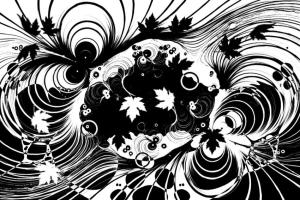
great image shawn,,loads to look at and admire,,love the motion in the piece and the details,,like the clouds you could stare at it for ages
      |
great image shawn,,loads to look at and admire,,love the motion in the piece and the details,,like the clouds you could stare at it for ages
Comment Written 13-Jan-2011
Comment from Extra
Really interesting work. Love the contrast of the b&w and love the contrasts in the shapes you have created. Really nice original work.
      |
Really interesting work. Love the contrast of the b&w and love the contrasts in the shapes you have created. Really nice original work.
Comment Written 13-Jan-2011
Comment from SLebredo
Great contrast piece! I really like the shapes and the leaves together. An exciting piece of artwork indeed!
      |
Great contrast piece! I really like the shapes and the leaves together. An exciting piece of artwork indeed!
Comment Written 13-Jan-2011
Comment from kanagraj
Beautiful composition and excellent ideas. great work from the great person.i like the elements you have been selected. Wonder black and white is very impressive. Good technique and impact. Very apprecitable presentation.
      |
Beautiful composition and excellent ideas. great work from the great person.i like the elements you have been selected. Wonder black and white is very impressive. Good technique and impact. Very apprecitable presentation.
Comment Written 13-Jan-2011
Comment from Pat Groleau
This is a wonderful design. you have lots of interesting features in the picture. I really like the leaves. The black and white really suits the picture. Nice work
Pat
      |
This is a wonderful design. you have lots of interesting features in the picture. I really like the leaves. The black and white really suits the picture. Nice work
Pat
Comment Written 12-Jan-2011
Comment from margas45
Initial impact 5
Creativity of presentation 5
Color Harmony 5
Center of Interest 5
Technical Excellence 5
Technique 5
Story Telling Ability 5
I like the energy created by the black and white. Serenity from the white, drama from the black. I like the leaves swirling randomly through the twister. Nice job!
      |
Initial impact 5
Creativity of presentation 5
Color Harmony 5
Center of Interest 5
Technical Excellence 5
Technique 5
Story Telling Ability 5
I like the energy created by the black and white. Serenity from the white, drama from the black. I like the leaves swirling randomly through the twister. Nice job!
Comment Written 12-Jan-2011
Comment from DavidLLoyd3
I find it interesting, that there is one primary difference between the vast majority of digital art, and traditional art. That is that in digital art balance is achieved by symmetry, overly centering. And with traditional art, balance is achieved by weight. Symmetry, and centering, are things to be avoided at all cost.
That aside:
To me the balance, and composition, both OK. Although to me a bit overly centered.
The light works well.
I see a creative and skilled imagination.
I see technical excellence.
I believe that this image carries a high capacity for story telling
Thank You for sharing,
D3
      |
I find it interesting, that there is one primary difference between the vast majority of digital art, and traditional art. That is that in digital art balance is achieved by symmetry, overly centering. And with traditional art, balance is achieved by weight. Symmetry, and centering, are things to be avoided at all cost.
That aside:
To me the balance, and composition, both OK. Although to me a bit overly centered.
The light works well.
I see a creative and skilled imagination.
I see technical excellence.
I believe that this image carries a high capacity for story telling
Thank You for sharing,
D3
Comment Written 12-Jan-2011
Comment from joyfulartist
I like the black and white effect of your design. I see many things in your picture. A pair of eyes on the left-hand corner. Then I see white and black shadow leaves.
I can also see the twister swirling around and gathering everything in sight.
Nice design.
      |
I like the black and white effect of your design. I see many things in your picture. A pair of eyes on the left-hand corner. Then I see white and black shadow leaves.
I can also see the twister swirling around and gathering everything in sight.
Nice design.
Comment Written 12-Jan-2011
