Expressive Mixed Media
Viewing comments for Page 16 "Completely Surreal"Photos heavily altered
28 total reviews
Comment from Faybells
Not really into fantasy but I really do like this one. Cannot fault it. like the colours, the effects. This would make a great CD cover.
reply by the author on 22-Mar-2014
       |
Not really into fantasy but I really do like this one. Cannot fault it. like the colours, the effects. This would make a great CD cover.
Comment Written 18-Mar-2014
reply by the author on 22-Mar-2014
-
Thank you so very much for the lovely review and of course also for the 6 stars.
Comment from Mara del Mar
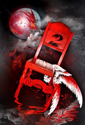
I love the great creativity and the vibrant red color, like the design and the symbol of dragon. Nice depth, good details, texture and frame. Well done. Luck.
Mara
reply by the author on 18-Mar-2014
      |
I love the great creativity and the vibrant red color, like the design and the symbol of dragon. Nice depth, good details, texture and frame. Well done. Luck.
Mara
Comment Written 17-Mar-2014
reply by the author on 18-Mar-2014
-
Thank you so very much for the lovely review
Comment from jesuel
What an amazing photo the color is great the detail is great excellent depth I really like the effects that you have used here awesome work great job
reply by the author on 18-Mar-2014
      |
What an amazing photo the color is great the detail is great excellent depth I really like the effects that you have used here awesome work great job
Comment Written 17-Mar-2014
reply by the author on 18-Mar-2014
-
Thank you so very much for the lovely review
Comment from Photography byTrixie
Great surrealistic mixed media. I really thought that this was a painting with the sharp image of the chair and ball/moon. technical 5 technique 5 like the composition, contrasts and depth of field. Love the treatment of the clouds and the paint like splatters.
reply by the author on 18-Mar-2014
       |
Great surrealistic mixed media. I really thought that this was a painting with the sharp image of the chair and ball/moon. technical 5 technique 5 like the composition, contrasts and depth of field. Love the treatment of the clouds and the paint like splatters.
Comment Written 17-Mar-2014
reply by the author on 18-Mar-2014
-
Thank you so very much for the lovely review and of course also for the very generous rating.
Comment from bandl
I find the composition quite intriguing. The reds are very well distributed. Only the wings on the share leave me a bit perplexed as to why you put them there. Artist prerogative I guess. Personally I would have left that part out.
reply by the author on 18-Mar-2014
      |
I find the composition quite intriguing. The reds are very well distributed. Only the wings on the share leave me a bit perplexed as to why you put them there. Artist prerogative I guess. Personally I would have left that part out.
Comment Written 17-Mar-2014
reply by the author on 18-Mar-2014
-
Thank you so very much for the lovely review and the comments about the wings. I suppose I added them because I liked the idea.
Comment from seshadri_sreenivasan
It is always nice to see alternate approaches.Imaginative. Well executed! The colour really speaks here.Good luck in the contest!
reply by the author on 18-Mar-2014
      |
It is always nice to see alternate approaches.Imaginative. Well executed! The colour really speaks here.Good luck in the contest!
Comment Written 17-Mar-2014
reply by the author on 18-Mar-2014
-
Thank you so very much for the lovely review and for your good luck wishes.
Comment from Tony B
Crazy violent display of a chair, who would have thought to accomplish this except for you.
How does an idea like this come about.
reply by the author on 18-Mar-2014
      |
Crazy violent display of a chair, who would have thought to accomplish this except for you.
How does an idea like this come about.
Comment Written 17-Mar-2014
reply by the author on 18-Mar-2014
-
Thank you so very much for the lovely review Tony. I have an idea, start to work with it, and then the result is completely different than what I have thought of when finished. LOL I wanted to use the red chair though.
Comment from jrconrad
Excellent use of Photoshop techniques. An excellent picture--very creative. Love the sense of chaos (?) around the chair. The colors really grab the eye. Great job.
reply by the author on 18-Mar-2014
      |
Excellent use of Photoshop techniques. An excellent picture--very creative. Love the sense of chaos (?) around the chair. The colors really grab the eye. Great job.
Comment Written 17-Mar-2014
reply by the author on 18-Mar-2014
-
Thank you so very much for the lovely review
Comment from click3333
You have done a wonderful job on this, absolutely wonderful surrealistic piece, with lots of images. Great entry for the contest. Just wonderful. Good luck in the contest.
reply by the author on 18-Mar-2014
       |
You have done a wonderful job on this, absolutely wonderful surrealistic piece, with lots of images. Great entry for the contest. Just wonderful. Good luck in the contest.
Comment Written 17-Mar-2014
reply by the author on 18-Mar-2014
-
Thank you so very much for the lovely review and for the very generous rating.
Comment from MKFlood
a very cool creation. the blend of images is excellent. the setip is great. nicely balnced and eye pleasing to the viewer. very cool and excellent work overall (standing and clapping)
reply by the author on 18-Mar-2014
      |
a very cool creation. the blend of images is excellent. the setip is great. nicely balnced and eye pleasing to the viewer. very cool and excellent work overall (standing and clapping)
Comment Written 16-Mar-2014
reply by the author on 18-Mar-2014
-
Thank you so very much for the lovely review
