Comment from
Angelheart The First
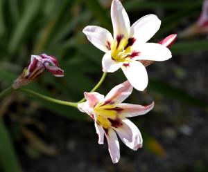
A lovely flower shot that shows the brightness in one and the shadows in the other.Blurred dark background works well for the presentation.If I may make a suggestion? If possible,could the dead flower be cloned out or the left side of the shot be cropped? Just a thought.Thanks for sharing this~
Angelheart
Comment Written 07-Feb-2016
reply by the author on 07-Feb-2016
Thank you so much....I left the dead flower in as part of life's realities :-)
reply by Angelheart The First on 09-Feb-2016
Okay good choice!!
It was my pleasure!
Comment from
Dick Lee Shia
Impressive capture but the upper bloom is on the verge of being overblown.
Please don't let the petal tips touch the frame (except for macro)...
Nice verdant backdrop in contrast with the vibrant florets.
Bright lighting.
Pin sharp focusing.
Thanks for sharing...
Comment Written 07-Feb-2016
reply by the author on 07-Feb-2016
Thank you for your feed back Dick....why is it important for the petal tip not to touch the frame...just curious?
reply by Dick Lee Shia on 07-Feb-2016
It seem to mean that you're not so sure whether to give a marginal space or not...


