
Birds in the Wild
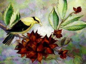
Viewing comments for Page 5 "Black-naped Oriole"Arty birds in their habitat
40 total reviews
Comment from jesuel
i would really like to know how to do this digital art you really get some fantastic results this one is no exception yet another fine success great job here
reply by the author on 05-Nov-2008
  |
i would really like to know how to do this digital art you really get some fantastic results this one is no exception yet another fine success great job here
Comment Written 04-Nov-2008
reply by the author on 05-Nov-2008
-
Thank you so much for the great review, James!!
Comment from Mike Roberts
Hey Shawn! Very nice work here with the beautiful bird and the fine plant composition. Your composition talent is outstanding. The forms are very natural, artistic, and certainly attractive. I like the nice highlights! Wonderful Shawn!
Mike
reply by the author on 05-Nov-2008
|
Hey Shawn! Very nice work here with the beautiful bird and the fine plant composition. Your composition talent is outstanding. The forms are very natural, artistic, and certainly attractive. I like the nice highlights! Wonderful Shawn!
Mike
Comment Written 04-Nov-2008
reply by the author on 05-Nov-2008
-
Thank you, Mike!! What wonderful and kind comments...I thank you very much. I haven't seen anything from you in a while. Are you working on something really big, beautiful & lavishly wonderful?
Comment from shiloh106
Nice composition. The colors work really well together. The yellow of the oriole is complimented very nicely by the reds of the flower. Nice diagonal line of the branch pulling the viewer across the work. Very pretty.
reply by the author on 05-Nov-2008
|
Nice composition. The colors work really well together. The yellow of the oriole is complimented very nicely by the reds of the flower. Nice diagonal line of the branch pulling the viewer across the work. Very pretty.
Comment Written 04-Nov-2008
reply by the author on 05-Nov-2008
-
Thank you for the wonderful comments and excellent on this, Shiloh!! Very much appreciated.
Comment from Jorge Gaete
Great work.
Beautiful detail and light.
The depth and framing are nearly perfect.
The colors blend to perfection and it radiates a great feeling.
I feel lucky to be alive to see a moment like this.
Very nice.
reply by the author on 04-Nov-2008
|
Great work.
Beautiful detail and light.
The depth and framing are nearly perfect.
The colors blend to perfection and it radiates a great feeling.
I feel lucky to be alive to see a moment like this.
Very nice.
Comment Written 04-Nov-2008
reply by the author on 04-Nov-2008
-
Looking at your portfolio, I consider your review a wonderful compliment. Thank you very much, Jorge!
-
You are very welcome and thanks for looking at my work.
Comment from katbird921
I love the colors you've chosen...that explosion of rich reds in the center is the perfect touch; the balance provided by the soft yellow of the bird and the greens is well thought.
I've witheld a half star because where is something about the eye that doesn't fit with the other elements; I can't decide if it's out of proportion to the size of the head, or if the placement of it is too close to the beak; I'm just not sure...and since I don't know a lot about art like this, I can only refer in my mind to the naturalness of photography subjects. I love the work, though, it is very pleasing to view, and those colors are awesome!
reply by the author on 04-Nov-2008
  |
I love the colors you've chosen...that explosion of rich reds in the center is the perfect touch; the balance provided by the soft yellow of the bird and the greens is well thought.
I've witheld a half star because where is something about the eye that doesn't fit with the other elements; I can't decide if it's out of proportion to the size of the head, or if the placement of it is too close to the beak; I'm just not sure...and since I don't know a lot about art like this, I can only refer in my mind to the naturalness of photography subjects. I love the work, though, it is very pleasing to view, and those colors are awesome!
Comment Written 04-Nov-2008
reply by the author on 04-Nov-2008
-
Thank you for taking the time to review this, katbird.
Comment from STICKMANART
Hi there ! this si cool, love the composition and the detailing as well as the lighting and teh colours are really cool as well!
Thanks !
TY!
reply by the author on 04-Nov-2008
|
Hi there ! this si cool, love the composition and the detailing as well as the lighting and teh colours are really cool as well!
Thanks !
TY!
Comment Written 04-Nov-2008
reply by the author on 04-Nov-2008
-
Thank you, Jack!!
Comment from Angelheart The First
This one is really very pretty Shawn.The color palette that you chose is really nice and soft on the eyes.I love the dark
color of the petals on the plant
and the shading of them is
very nice.Nice depth in the leaves and the branches.I have to say it's a real five star
delight!
Angelheart :)
reply by the author on 04-Nov-2008
|
This one is really very pretty Shawn.The color palette that you chose is really nice and soft on the eyes.I love the dark
color of the petals on the plant
and the shading of them is
very nice.Nice depth in the leaves and the branches.I have to say it's a real five star
delight!
Angelheart :)
Comment Written 04-Nov-2008
reply by the author on 04-Nov-2008
-
Thank you, Angel!!!
-
You're very welcome! :)
Comment from DrCArt222
This is among the best I've seen of your works, Shawn, all of which share a common geometric style. It is interesting how so many really good artist miss the opportunity of being great artists by failing to understand the properties of geometry in creative composition. Indeed, the arrangement of objects and how the lines and shapes inherent among them flow together are more important even than the subject itself. In this work, the geometry is correctly and remarkably reactive with contravening angles formed by the bird against its colorful perch. Very well done and thank you for sharing.--Dr. Carlton
reply by the author on 04-Nov-2008
|
This is among the best I've seen of your works, Shawn, all of which share a common geometric style. It is interesting how so many really good artist miss the opportunity of being great artists by failing to understand the properties of geometry in creative composition. Indeed, the arrangement of objects and how the lines and shapes inherent among them flow together are more important even than the subject itself. In this work, the geometry is correctly and remarkably reactive with contravening angles formed by the bird against its colorful perch. Very well done and thank you for sharing.--Dr. Carlton
Comment Written 04-Nov-2008
reply by the author on 04-Nov-2008
-
Thank you, Dr. Carlton, for the very informative review. I really appreciate the added critique. Now if I can just learn to apply it as a standard rule of thumb, although, I wouldn't think that it would apply to everything. For instance, the painting of the castle you just posted. How does this apply to a painting such as that when there are so many different shapes, angles, etc.? Correct, or no? I am very interested, not arguing.
-
Hi Shawn, I am so glad you asked that question. If you have ever taken a formal course in art, you may recall being instructed on pre-composition planning. This may include drawings and sketches and perhaps an under-painting, but most importantly a study, totally void of detail--just lines, shapes, shadow and color. The purpose for this is to test how your eyes will move into and around your composition. For example, eyes are always drawn first to shadow, then to light, first to sharp lines and then to curved lines and finally, first to high-frequency colors such as reds and yellows then to the low-frequency colors such as blues and greens. This is certainly an oversimplification, but armed with this principle, you can now control precisely how the eyes behave when viewing your work. If you look at any one of my digital or traditional works, whether you like them or not, the eye is always moved into the center because of how I use color, shadow and geometry. My latest work "In the Days of Knights" can be used as an example. View the work, but concentrate only on the lines--the flow of the river, how the castle moves in sort of a curve, hugging the ridge all in unison with the foreground tree line as well as the lines formed by the background ridge at left. Then note how I oppose this flow to balance the composition with the way the bridge crosses the foreground tree line toward the rock formation on the right--these are all carefully planned to be sure. With digital art, it is often helpful to create a prototype, then, using the dry-brush filter available with Adobe PS, rendering the image into an impressionist work. The impressionist view will then allow you to concentrate on form rather than content. Finally, most of your own work reflects this same pattern of precision geometry which, if you are doing this instinctively, suggests to me that you are a natural. I have reduced my own artistic instincts to science so that I could teach others the method. I hope you will not mind my lengthy digression.--Dieter
Comment from BingoStar
Interesting story of the Black-naped Oriole. Great colors nice pretty yellow and black Oriole so intent on its special food find. Nice shaped leafs and I really like the multicolored pastel background. It adds so much to your main display. Again Excellent my friend Bingo!
reply by the author on 04-Nov-2008
|
Interesting story of the Black-naped Oriole. Great colors nice pretty yellow and black Oriole so intent on its special food find. Nice shaped leafs and I really like the multicolored pastel background. It adds so much to your main display. Again Excellent my friend Bingo!
Comment Written 04-Nov-2008
reply by the author on 04-Nov-2008
-
Thank you, Bingo!!
Comment from ARTHOUND
I DON'T KNOW HOW YOU DO IT BUT I LIKEIT YOU START WITH WATER COLORS THEN YOU DIGITALLY ENHANCE IT I DON'T KNOW HOW BUT YOU SURE GOT SOME GREAT RESULTS FROM IT I LIKE THE SOFTNESS OF THE BACKGROUND IT IS SO SOFT LOVE THE BIRD AND THE TREE LIMB THAT HE IS SNACKING ON GREAT LOOKING PIECE I LIKE THE FLOWERS THAT YOU PUT ON THE PLANT AND THE GREWAT USE OF THE COLORS THAT YOU CHOSE FOR THIS GREAT ARTWORK ARTHOUND JOHN
reply by the author on 04-Nov-2008
|
I DON'T KNOW HOW YOU DO IT BUT I LIKEIT YOU START WITH WATER COLORS THEN YOU DIGITALLY ENHANCE IT I DON'T KNOW HOW BUT YOU SURE GOT SOME GREAT RESULTS FROM IT I LIKE THE SOFTNESS OF THE BACKGROUND IT IS SO SOFT LOVE THE BIRD AND THE TREE LIMB THAT HE IS SNACKING ON GREAT LOOKING PIECE I LIKE THE FLOWERS THAT YOU PUT ON THE PLANT AND THE GREWAT USE OF THE COLORS THAT YOU CHOSE FOR THIS GREAT ARTWORK ARTHOUND JOHN
Comment Written 04-Nov-2008
reply by the author on 04-Nov-2008
-
Thank you for the fantastic comments, John!!