Misc. Works
Viewing comments for Page 42 "Battling for Supremacy"Odds and Ends
33 total reviews
Comment from cleo85
They seem very serious about their battle. The have a killer look in their eyes.
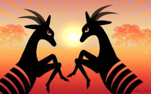
The unusual coloring as the combination with the partly silhouetted main subjects and the almost mirroring images makes the picture very interesting. The viewer is out to find the differences between the right and left part of the picture.
      |
They seem very serious about their battle. The have a killer look in their eyes.
The unusual coloring as the combination with the partly silhouetted main subjects and the almost mirroring images makes the picture very interesting. The viewer is out to find the differences between the right and left part of the picture.
Comment Written 12-May-2010
Comment from loneWolf
Spectacular visual impact.
The unique forms of black are contrasting just wonderfully with the bright orange background. The lighting is perfect. Eyes are intense. Gives the viewer a story in our minds. Thanks for sharing this beauty.
      |
Spectacular visual impact.
The unique forms of black are contrasting just wonderfully with the bright orange background. The lighting is perfect. Eyes are intense. Gives the viewer a story in our minds. Thanks for sharing this beauty.
Comment Written 12-May-2010
Comment from seshadri_sreenivasan
Your artwork in its abstract form lends itself to many interpretations .Today?s technology affords artists to express themselves in many ways. This is an interesting composition with symmetrical figures and vibrant colours.Well done.
      |
Your artwork in its abstract form lends itself to many interpretations .Today?s technology affords artists to express themselves in many ways. This is an interesting composition with symmetrical figures and vibrant colours.Well done.
Comment Written 12-May-2010
Comment from jgrace
Great design. Love the intense look in the antelope's eyes. Great color and background design works perfectly fror this. The main image is well positioned within the composition. Well done. Enjoyed it.
      |
Great design. Love the intense look in the antelope's eyes. Great color and background design works perfectly fror this. The main image is well positioned within the composition. Well done. Enjoyed it.
Comment Written 12-May-2010
Comment from ArtemisX
Very lovely. The dark blacks in the foreground creates a striking effect. Even more so with its striped bodies, making both line and colour work together to catch the eye. The faded background is just discernible enough to make out where they are but not too clear that it takes attention from the battle in front. The position of the sun is dramatic, almost like a spotlight or a silent witness.
      |
Very lovely. The dark blacks in the foreground creates a striking effect. Even more so with its striped bodies, making both line and colour work together to catch the eye. The faded background is just discernible enough to make out where they are but not too clear that it takes attention from the battle in front. The position of the sun is dramatic, almost like a spotlight or a silent witness.
Comment Written 12-May-2010
Comment from Celia Claase
Very striking initial impact. I like the lines in the picture created by the sunrays, stripes on the animals and their horns. Your choice of colours is very nice and the eyes looks alive. Well done.
      |
Very striking initial impact. I like the lines in the picture created by the sunrays, stripes on the animals and their horns. Your choice of colours is very nice and the eyes looks alive. Well done.
Comment Written 12-May-2010
Comment from Cephus
Have no idea of who's going to win as they look evenly matched to me.
Colors are great, nice symmetry on the antelopes but not on the landscape. Well balanced, excellent eye appeal. Very good balance and composition, and it commands eye appeal.
      |
Have no idea of who's going to win as they look evenly matched to me.
Colors are great, nice symmetry on the antelopes but not on the landscape. Well balanced, excellent eye appeal. Very good balance and composition, and it commands eye appeal.
Comment Written 11-May-2010
Comment from jandaly
This is a fabulous digital creation!! I love the amazing colours you've used, the fabulous scene!! Very beautiful and truly interesting to view!! GREAT work!!
Jan :)
       |
This is a fabulous digital creation!! I love the amazing colours you've used, the fabulous scene!! Very beautiful and truly interesting to view!! GREAT work!!
Jan :)
Comment Written 11-May-2010
Comment from Farmboy
This one is definitely a winner. So simple and powerful with emotion and atmosphere.
The only thing I would want to change is to soften the transition between each sunbeam, maybe make the beams wider and emanate from the center or outside edges of the sun rather than the bottom.
        |
This one is definitely a winner. So simple and powerful with emotion and atmosphere.
The only thing I would want to change is to soften the transition between each sunbeam, maybe make the beams wider and emanate from the center or outside edges of the sun rather than the bottom.
Comment Written 11-May-2010
Comment from ladyceridwen55
Great colors , patterns and lines.
Techique is nice also.
I like the sun an the trees in the background.
The antelope are very nice also.
thanks for sharing
      |
Great colors , patterns and lines.
Techique is nice also.
I like the sun an the trees in the background.
The antelope are very nice also.
thanks for sharing
Comment Written 11-May-2010
