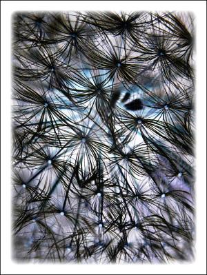
Inverted Beauty
Close up of dandelion seeds32 total reviews
Comment from Zilyram
You inspire me to get some better software to play with some of my photos. I loved the original and really like what you have done with this. The coloring is really unusual and grabs your attention immediately.
reply by the author on 16-Jun-2011
      |
You inspire me to get some better software to play with some of my photos. I loved the original and really like what you have done with this. The coloring is really unusual and grabs your attention immediately.
Comment Written 15-Jun-2011
reply by the author on 16-Jun-2011
-
Thank you very much
Comment from Anne
This one is really neat too. I like the way all the black looks in this and then you see just a hint of color in the background. Amazing how just a color change makes the picture look so different. An excellent picture.
reply by the author on 16-Jun-2011
      |
This one is really neat too. I like the way all the black looks in this and then you see just a hint of color in the background. Amazing how just a color change makes the picture look so different. An excellent picture.
Comment Written 15-Jun-2011
reply by the author on 16-Jun-2011
-
Thank you very much
Comment from Kaluphotography
I like it.
Very creative photo and great creativity with the way you inverted this.
I like that background gives this a great focus.
Thanks for sharing Lou
reply by the author on 16-Jun-2011
      |
I like it.
Very creative photo and great creativity with the way you inverted this.
I like that background gives this a great focus.
Thanks for sharing Lou
Comment Written 15-Jun-2011
reply by the author on 16-Jun-2011
-
Thank you very much
Comment from bosch2
I think I do like the original better, but this one is just as interesting. I like the darker contrast of the seeds - it makes me feel like I'm on the inside, looking out!
reply by the author on 15-Jun-2011
      |
I think I do like the original better, but this one is just as interesting. I like the darker contrast of the seeds - it makes me feel like I'm on the inside, looking out!
Comment Written 15-Jun-2011
reply by the author on 15-Jun-2011
-
Thank you very much
Comment from sandralee
I do think this is a cool shot. Now you make me want to see if I can invert one of my own photos. Doesn't look like a photo -a new age mattress? Very interesting pattern and design. Like what you tried.
reply by the author on 15-Jun-2011
      |
I do think this is a cool shot. Now you make me want to see if I can invert one of my own photos. Doesn't look like a photo -a new age mattress? Very interesting pattern and design. Like what you tried.
Comment Written 15-Jun-2011
reply by the author on 15-Jun-2011
-
Thank you very much
Comment from mnmcarta
This one is so cool! I love the invert look to it. Very appealing and would make an awesome PC background! Great job :)
reply by the author on 15-Jun-2011
      |
This one is so cool! I love the invert look to it. Very appealing and would make an awesome PC background! Great job :)
Comment Written 15-Jun-2011
reply by the author on 15-Jun-2011
-
Thank you very much
Comment from Kikaspics
Oh yes.. What a great creative idea to invert this image. I love how it has come out with thee almost blue centers to the seeds. Well done. Thanks for sharing.
reply by the author on 15-Jun-2011
      |
Oh yes.. What a great creative idea to invert this image. I love how it has come out with thee almost blue centers to the seeds. Well done. Thanks for sharing.
Comment Written 15-Jun-2011
reply by the author on 15-Jun-2011
-
Thank you very much
Comment from DiannaM
I really like it. Very creative. Wondering if resolution is good enough that you could crop it to focus on more of the blue area in the upper middle? Just a thought. Very nice abstract with great EOD.
reply by the author on 15-Jun-2011
      |
I really like it. Very creative. Wondering if resolution is good enough that you could crop it to focus on more of the blue area in the upper middle? Just a thought. Very nice abstract with great EOD.
Comment Written 15-Jun-2011
reply by the author on 15-Jun-2011
-
Thank you very much
Comment from Dr. Michael Shelton
this is a BEAUTIFUL WEB OF PATTERN it has great design and balance i love he abstract look of the piece it is bold and strong nice job and thanks for sharing this work of art
reply by the author on 15-Jun-2011
      |
this is a BEAUTIFUL WEB OF PATTERN it has great design and balance i love he abstract look of the piece it is bold and strong nice job and thanks for sharing this work of art
Comment Written 15-Jun-2011
reply by the author on 15-Jun-2011
-
Thank you very much
Comment from no1nikon
like this one as well the negative image is almost better than the original great picture shows creativity and fills the frame nicely kind regards stephen
reply by the author on 15-Jun-2011
      |
like this one as well the negative image is almost better than the original great picture shows creativity and fills the frame nicely kind regards stephen
Comment Written 15-Jun-2011
reply by the author on 15-Jun-2011
-
Thank you very much
