Misc. Works
Viewing comments for Page 26 "Not Entirely Correct"Odds and Ends
42 total reviews
Comment from Skyangel02
I like the interesting title of the work. It makes me look at it to try to see what is not entirely correct.
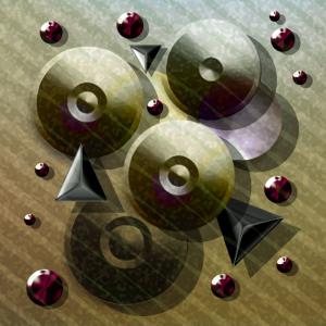
I see the light and shadows on the disks do not line up with the digital shadows but they do on the "rubies".
It is a bit like a puzzle where you look at it carefully to see what it out of place. Very fascinating with a great 3D effect as well.
Well done.
      |
I like the interesting title of the work. It makes me look at it to try to see what is not entirely correct.
I see the light and shadows on the disks do not line up with the digital shadows but they do on the "rubies".
It is a bit like a puzzle where you look at it carefully to see what it out of place. Very fascinating with a great 3D effect as well.
Well done.
Comment Written 06-Jan-2013
Comment from Glen Spey
This is a good piece of abstract art, looks like some kind of tape player of movie real. Good choice of color and very creative.
Thanks for sharing!
      |
This is a good piece of abstract art, looks like some kind of tape player of movie real. Good choice of color and very creative.
Thanks for sharing!
Comment Written 05-Jan-2013
Comment from fotograzio
Nice three dimensional feel and effect with the geometric objects and their placement. the diagonal, spaced lines add that extra sense of depth and perception. Nice highlights and drop shadow effects to make the whole piece come to life. My type of abstract digital art. It would display well and look marvelous matted and framed.
      |
Nice three dimensional feel and effect with the geometric objects and their placement. the diagonal, spaced lines add that extra sense of depth and perception. Nice highlights and drop shadow effects to make the whole piece come to life. My type of abstract digital art. It would display well and look marvelous matted and framed.
Comment Written 05-Jan-2013
Comment from Samco
Interesting design. Shadow placement is great. The colors you chose blend very well together I especially like the light purple on the disc in the back.
       |
Interesting design. Shadow placement is great. The colors you chose blend very well together I especially like the light purple on the disc in the back.
Comment Written 05-Jan-2013
Comment from Aunita
There really aren't a lot of different shapes or colors to this but It really draws my eye in and I love looking at it. It has a calming affect somehow. I love the soft colors to it also. Really Nice work.
      |
There really aren't a lot of different shapes or colors to this but It really draws my eye in and I love looking at it. It has a calming affect somehow. I love the soft colors to it also. Really Nice work.
Comment Written 05-Jan-2013
Comment from Phyllis Stewart
This is a very good abstract in two geometric shapes. Good shading and color. Composition is great. I like the overlaid diagonal stripes that holds it all together.
      |
This is a very good abstract in two geometric shapes. Good shading and color. Composition is great. I like the overlaid diagonal stripes that holds it all together.
Comment Written 05-Jan-2013
Comment from bebebug
I like the color harmony in this image. Great addition of textures and shadows creating depth. Well done!
      |
I like the color harmony in this image. Great addition of textures and shadows creating depth. Well done!
Comment Written 05-Jan-2013
Comment from sohailanwar
Nice digital art work with fantastic looking formation,so lovely colors composition with quality art work..
      |
Nice digital art work with fantastic looking formation,so lovely colors composition with quality art work..
Comment Written 05-Jan-2013
Comment from adr1an
this is an intriguing artwork shawn with super colouring & geometric application of shapes & design, i like the lines running diagonally through it which seems to exaggerate the shadows direction & one light source-i guess the reason for your title is that there appears to be another light source in this which does not throw any shadows-it certainly made me think for a while to notice that-good stuff & a tribute to your skills & technique!
      |
this is an intriguing artwork shawn with super colouring & geometric application of shapes & design, i like the lines running diagonally through it which seems to exaggerate the shadows direction & one light source-i guess the reason for your title is that there appears to be another light source in this which does not throw any shadows-it certainly made me think for a while to notice that-good stuff & a tribute to your skills & technique!
Comment Written 05-Jan-2013
Comment from WendyG
A wonderful display of circles and triangles all gathered together to make beautiful work of art. Love the lines going through it and the calming colors are terrific. Excellent work of art:)
      |
A wonderful display of circles and triangles all gathered together to make beautiful work of art. Love the lines going through it and the calming colors are terrific. Excellent work of art:)
Comment Written 05-Jan-2013
