Misc. Works
Viewing comments for Page 26 "Not Entirely Correct"Odds and Ends
42 total reviews
Comment from Christine389
Visually very appealing - I love the composition of the different shapes and the limited use of colour too. I'm not entirely sure why it's 'not entirely correct' - but I like it very much indeed!
      |
Visually very appealing - I love the composition of the different shapes and the limited use of colour too. I'm not entirely sure why it's 'not entirely correct' - but I like it very much indeed!
Comment Written 05-Jan-2013
Comment from seshadri_sreenivasan
Art has its own laws of physics from the energy between viewer and artwork. You have created some essentials in geometric patterns. I feel drawn towards it.overall an interesting composition!
      |
Art has its own laws of physics from the energy between viewer and artwork. You have created some essentials in geometric patterns. I feel drawn towards it.overall an interesting composition!
Comment Written 05-Jan-2013
Comment from branflakes13
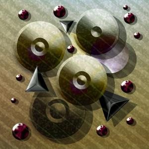
The piece is very modern yet abstract at the same time. The red circles add much color and border the entire piece very well. The shadows of all elements portray much depth. The diagonal stripes that go across the entire piece creates flow and movement. The artwork overall is outstanding and very well done.
      |
The piece is very modern yet abstract at the same time. The red circles add much color and border the entire piece very well. The shadows of all elements portray much depth. The diagonal stripes that go across the entire piece creates flow and movement. The artwork overall is outstanding and very well done.
Comment Written 04-Jan-2013
Comment from Jaybone
This has a very balanced feel while being entirely random.Everything looks to be floating from the shadows. Interesting light source treatment. One for the small red "jewels", second for the larger discs, and maybe a multi-directional one for the triangles...I really like the BG with two (or more)patterns and the gradient, cool! Great Work!
      |
This has a very balanced feel while being entirely random.Everything looks to be floating from the shadows. Interesting light source treatment. One for the small red "jewels", second for the larger discs, and maybe a multi-directional one for the triangles...I really like the BG with two (or more)patterns and the gradient, cool! Great Work!
Comment Written 04-Jan-2013
Comment from TwistedZepher
This is just simply awesome!! I love the gritty, metallic feel that this picture has to it. The shapes are just so very well shaded and colored they look like something that you would see within maybe a graphic logo... or something represent something that has to do with tools. Really nice work :)
      |
This is just simply awesome!! I love the gritty, metallic feel that this picture has to it. The shapes are just so very well shaded and colored they look like something that you would see within maybe a graphic logo... or something represent something that has to do with tools. Really nice work :)
Comment Written 04-Jan-2013
Comment from donkeyoatey
It certainly is different, and I find the shadows a bit intriguing. they not only add depth, they add a feel of slow motion. I like the diagonal composition and I like the background color and design and the way you have carried it onto the shapes. Donkeyoatey
      |
It certainly is different, and I find the shadows a bit intriguing. they not only add depth, they add a feel of slow motion. I like the diagonal composition and I like the background color and design and the way you have carried it onto the shapes. Donkeyoatey
Comment Written 04-Jan-2013
Comment from Jorge Gaete
I love the feeling of depth.
Good colors and use of light.
It allows the viewer to decide what it all means.
In my opinion a very nice abstract piece, good work.
Jorge.
      |
I love the feeling of depth.
Good colors and use of light.
It allows the viewer to decide what it all means.
In my opinion a very nice abstract piece, good work.
Jorge.
Comment Written 04-Jan-2013
Comment from marieann green
Great technique used in creating this image. Imaginative and creative post.
Excellent colors, design and clarity. Very well done
      |
Great technique used in creating this image. Imaginative and creative post.
Excellent colors, design and clarity. Very well done
Comment Written 04-Jan-2013
Comment from Angelheart The First
Absolutely have got to give
you a six star for this.I love
the metallic colors and the
geometricv shapes.The place-
ment is excellent and love the lighting and shadows.Great
way to start the year Sean~
Angelheart :)
       |
Absolutely have got to give
you a six star for this.I love
the metallic colors and the
geometricv shapes.The place-
ment is excellent and love the lighting and shadows.Great
way to start the year Sean~
Angelheart :)
Comment Written 04-Jan-2013
Comment from Liilia
Masterful use of PSP and PS. Strong statement here, colors original, shapes 'pop'. Even the slight diagonal lines work to soften the 'metal' look. Love the ruby like jewels scattered throughout. It is a pleasure to view and review.
This rating does not count towards story rating or author rank.
The highest and the lowest rating are not included in calculations.
        |
Masterful use of PSP and PS. Strong statement here, colors original, shapes 'pop'. Even the slight diagonal lines work to soften the 'metal' look. Love the ruby like jewels scattered throughout. It is a pleasure to view and review.
This rating does not count towards story rating or author rank.
The highest and the lowest rating are not included in calculations.
Comment Written 04-Jan-2013
