Misc. Works
Viewing comments for Page 37 "Crest of the Knight"Odds and Ends
48 total reviews
Comment from Nadege
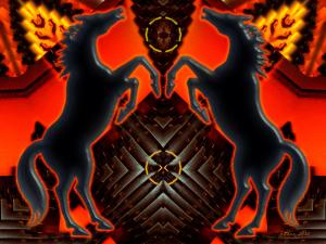
Technically excellent with good symetry and colours, it would make a fine shield.
Love the horses, another very fine creation.
      |
Technically excellent with good symetry and colours, it would make a fine shield.
Love the horses, another very fine creation.
Comment Written 16-Aug-2010
Comment from MichaelPhotos
This would definately make a great design for the front breast plate of some armor or the design in a sheild. Nice looking details you provided
      |
This would definately make a great design for the front breast plate of some armor or the design in a sheild. Nice looking details you provided
Comment Written 16-Aug-2010
Comment from Anne
Now you know this one has to be excellent. It has horses in it!. The coloring in this is great. The repetition, the highlights, the way you have the yellow in this, the detail are all excellent. A wonderful, creative and excellent work of art.
      |
Now you know this one has to be excellent. It has horses in it!. The coloring in this is great. The repetition, the highlights, the way you have the yellow in this, the detail are all excellent. A wonderful, creative and excellent work of art.
Comment Written 16-Aug-2010
Comment from Raphael Photography
A very different image. This looks very professional and would take some technical skill to create this. Good design and composition. Good creative expression.
      |
A very different image. This looks very professional and would take some technical skill to create this. Good design and composition. Good creative expression.
Comment Written 16-Aug-2010
Comment from cmoisel
Good creative piece of art
Love the symmetry
Good colour contrast
The whole composition is eye catching
Good light and shade shown here
Thanks for sharing
      |
Good creative piece of art
Love the symmetry
Good colour contrast
The whole composition is eye catching
Good light and shade shown here
Thanks for sharing
Comment Written 16-Aug-2010
Comment from stanjo
This is cool looking I like the designs you created out of this, the colors look like fire, the horses add an impact to this very nicely done and presented thanks for sharing!!
This rating does not count towards story rating or author rank.
The highest and the lowest rating are not included in calculations.
        |
This is cool looking I like the designs you created out of this, the colors look like fire, the horses add an impact to this very nicely done and presented thanks for sharing!!
This rating does not count towards story rating or author rank.
The highest and the lowest rating are not included in calculations.
Comment Written 16-Aug-2010
Comment from Pauljk
The rendering on the horses looks great. Reminds me of the prancing horse on the front of a Ferrari! The fractal contrast is high and gives a nice glow to the overall image.
This rating does not count towards story rating or author rank.
The highest and the lowest rating are not included in calculations.
reply by the author on 16-Aug-2010
      |
The rendering on the horses looks great. Reminds me of the prancing horse on the front of a Ferrari! The fractal contrast is high and gives a nice glow to the overall image.
This rating does not count towards story rating or author rank.
The highest and the lowest rating are not included in calculations.
Comment Written 16-Aug-2010
reply by the author on 16-Aug-2010
-
Thank you, Paul, for taking the time to view and review. Not sure if you mean an actual fractal program was used in creating this, but no, just plain ol' PSP 9 & PSPP X2. I did forget to put that in the description. Again, thank you! :) Shawn
-
Hi Shawn. No I just meant the fractal image looked good :-)
-
Oh, OK :) You did remind me though, that I forgot to write the programs used, so thank you :)
Comment from Jerrica
Wow, you must have one heck of an imagination to come up with this from a freezer door!
I love the symmetry and the colours are very striking.
thank you for sharing.
      |
Wow, you must have one heck of an imagination to come up with this from a freezer door!
I love the symmetry and the colours are very striking.
thank you for sharing.
Comment Written 16-Aug-2010
Comment from joyfulartist
You did a lot with the picture of a steel freezer door at the popular chicken take-out.
The horses are wonderful and I like how were you put the red as it outlines them.
Also the other designs in the picture does make it look like it could be a "Crest of the Knight."
Very well done.
      |
You did a lot with the picture of a steel freezer door at the popular chicken take-out.
The horses are wonderful and I like how were you put the red as it outlines them.
Also the other designs in the picture does make it look like it could be a "Crest of the Knight."
Very well done.
Comment Written 16-Aug-2010
Comment from Look Beyond The Lens
Initial Impression 5
Creativity of Presentation 5
Center of interest 5
technical excellence 5
technique 5
lighting 5
story telling ability is excellent
I love the fact areas of this look Native American. The different textures, the light and colors are excellent.
      |
Initial Impression 5
Creativity of Presentation 5
Center of interest 5
technical excellence 5
technique 5
lighting 5
story telling ability is excellent
I love the fact areas of this look Native American. The different textures, the light and colors are excellent.
Comment Written 16-Aug-2010
