Misc. Works
Viewing comments for Page 26 "Not Entirely Correct"Odds and Ends
42 total reviews
Comment from SteveANH
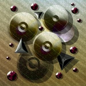
Wonderful feeling of depht with the overlaying circle and triangles. The background "wallpaper" is complimentary to the other shapes and colors. Nicely framed.
      |
Wonderful feeling of depht with the overlaying circle and triangles. The background "wallpaper" is complimentary to the other shapes and colors. Nicely framed.
Comment Written 04-Jan-2013
Comment from amfunny
This is very cool looking. I like the bronze metallic look to it. It reminds me of doorknobs and other parts. Very creatively done.
      |
This is very cool looking. I like the bronze metallic look to it. It reminds me of doorknobs and other parts. Very creatively done.
Comment Written 04-Jan-2013
Comment from Levon7
Nice shapes and variety of. I like the graduation of colors in this. The indented and outdented(?) centers look cool. Very interesting composition. Good digital skills. I like it.
thank you, Natalie
      |
Nice shapes and variety of. I like the graduation of colors in this. The indented and outdented(?) centers look cool. Very interesting composition. Good digital skills. I like it.
thank you, Natalie
Comment Written 04-Jan-2013
Comment from Shakeadog
I like the geometric shapes to this
Very creative and terrific results
Good angle of light to highlight it too
Very good composition
The tones and colours work well for it
Nicely done
      |
I like the geometric shapes to this
Very creative and terrific results
Good angle of light to highlight it too
Very good composition
The tones and colours work well for it
Nicely done
Comment Written 04-Jan-2013
Comment from TM.Lawrence
I like the color of the round figures. After careful examination of the large and medium small purple "buttons" I noticed chromosomes inside if them. Very nice accent with biology whether intended or unintended. I think the diagonal stripes distract from the smaller purple buttons and make it harder to see the chromosomes.
      |
I like the color of the round figures. After careful examination of the large and medium small purple "buttons" I noticed chromosomes inside if them. Very nice accent with biology whether intended or unintended. I think the diagonal stripes distract from the smaller purple buttons and make it harder to see the chromosomes.
Comment Written 04-Jan-2013
Comment from drmerlin
I love the creativity and composition in this image. Great symmetry and excellent use of light. Very nice indeed.
      |
I love the creativity and composition in this image. Great symmetry and excellent use of light. Very nice indeed.
Comment Written 04-Jan-2013
Comment from avmurray
When I saw this work as a thumbnail, I had to have a closer look. I really like how you have used different shapes and lines to create this. I also like the range of colors by the use of a limited pallet.
The texture with the diagonal lines is very effective and I like the gradient of it from light gray to a darker beige. The circles and triangles are placed in a way to give this creation a good balance, and think this would have looked good without the purple "jewels" added as well. By adding them you have however used the space well.
This is original and creative and well thought out.
      |
When I saw this work as a thumbnail, I had to have a closer look. I really like how you have used different shapes and lines to create this. I also like the range of colors by the use of a limited pallet.
The texture with the diagonal lines is very effective and I like the gradient of it from light gray to a darker beige. The circles and triangles are placed in a way to give this creation a good balance, and think this would have looked good without the purple "jewels" added as well. By adding them you have however used the space well.
This is original and creative and well thought out.
Comment Written 04-Jan-2013
Comment from sonshine
Very nice art piece..cool shapes in such a differant aray of colors and sizes. You wouldn't even know that they were made on the computer instead of through a computerized machine. They are very sharp focused with a great clarity and the framing excellent. Great job...thank you for sharing :)
       |
Very nice art piece..cool shapes in such a differant aray of colors and sizes. You wouldn't even know that they were made on the computer instead of through a computerized machine. They are very sharp focused with a great clarity and the framing excellent. Great job...thank you for sharing :)
Comment Written 04-Jan-2013
Comment from stleonardmom
Great initial impact. Colors work harmoniously together and the overall image makes good use of the entire field. Good depth, almost a 3D feel to it. An overall well done creation.
      |
Great initial impact. Colors work harmoniously together and the overall image makes good use of the entire field. Good depth, almost a 3D feel to it. An overall well done creation.
Comment Written 04-Jan-2013
Comment from sweetdweems
Nice composition. Great colors and I like that you added shadows for dimension. Reminds me of Bling.
      |
Nice composition. Great colors and I like that you added shadows for dimension. Reminds me of Bling.
Comment Written 04-Jan-2013
