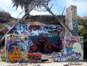
Graffiti art on the beach
Just an old abandoned house on the beach29 total reviews
Comment from Snapdecisions
A superb shot ! , the color display is awesome , accompanied by razor clarity and excellent presentation , the technical side is very impressive , Well done with this Lucien , Trev
reply by the author on 11-Dec-2009
  |
A superb shot ! , the color display is awesome , accompanied by razor clarity and excellent presentation , the technical side is very impressive , Well done with this Lucien , Trev
Comment Written 11-Dec-2009
reply by the author on 11-Dec-2009
-
Trev,
once again thank you for the having looked and then written me with your thought on my photo, very much appreciated. have a great week and as always.. cheers!
Lucien
-
You to Lucien , Trev
Comment from donkeyoatey
This is true graffiti, not a mural. Some of it is extremely artistic too! Your shot is extremely well composed and shows THEIR artwork very well. Donkeyoatey
reply by the author on 11-Dec-2009
|
This is true graffiti, not a mural. Some of it is extremely artistic too! Your shot is extremely well composed and shows THEIR artwork very well. Donkeyoatey
Comment Written 11-Dec-2009
reply by the author on 11-Dec-2009
-
donkeyoatey,
yep gaffitti, what a great idea for another photo contest, take a photo of a mural form you local area. anyway thank you for having taken the time to look and then commenting on my photo. i appreciate the support. take care and cheers!
Lucien
Comment from slblevins
Very colorful and creative. Like the trees arching over the house for more interest. Graffiti is nice probably painted by whoever lived there. Best entry for the contest I have seen. slblevins:)
reply by the author on 11-Dec-2009
|
Very colorful and creative. Like the trees arching over the house for more interest. Graffiti is nice probably painted by whoever lived there. Best entry for the contest I have seen. slblevins:)
Comment Written 11-Dec-2009
reply by the author on 11-Dec-2009
-
slblevins,
thank you for the high compliment. I appreciate the fact you liked it and then wrote me your thoughts. take care ... cheers!
Lucien
Comment from crystal clear
It is fantastic this art of graffiti isn't it? All different people coming together to express their ideas and beliefs through art...The photo is well balanced due to the shape of the structure itself as well as the unique leaning trees! Nice entry!
reply by the author on 11-Dec-2009
|
It is fantastic this art of graffiti isn't it? All different people coming together to express their ideas and beliefs through art...The photo is well balanced due to the shape of the structure itself as well as the unique leaning trees! Nice entry!
Comment Written 11-Dec-2009
reply by the author on 11-Dec-2009
-
crystal clear,
appreciate the time you have taken once again to look at one of my pieces. I truly appreciate the support of me and my work.
hope you have a great day, as always take care... cheers!
lucien
Comment from PipesLine
Center of interest is well defined in the photo. All aspects of the shot are well balanced in the frame. The lighting/color worked out well also. Certainly a story in the picture, in fact a number of them. Good tech work also. I might crop out the small brown something in the very forefront of the frame, Can't see a reason why it should be there. Nice picture to review
reply by the author on 11-Dec-2009
|
Center of interest is well defined in the photo. All aspects of the shot are well balanced in the frame. The lighting/color worked out well also. Certainly a story in the picture, in fact a number of them. Good tech work also. I might crop out the small brown something in the very forefront of the frame, Can't see a reason why it should be there. Nice picture to review
Comment Written 11-Dec-2009
reply by the author on 11-Dec-2009
-
Pipesline,
just adds to the depth and give it more of a beach feel as I see it. thank you for the time and the comments on this photo. they are all very much appreciated by me, take care .. cheers!
Lucien
Comment from debi-d
I love to photograph graffitti as well. I think it could be cropped a little tighter. The top of the sky doesnt add to the photo at all. I know the trees frame it in. But less can be more sometimes.
Teh dark like door really pulls you into the photo though. Interesting capture.
deb
reply by the author on 11-Dec-2009
|
I love to photograph graffitti as well. I think it could be cropped a little tighter. The top of the sky doesnt add to the photo at all. I know the trees frame it in. But less can be more sometimes.
Teh dark like door really pulls you into the photo though. Interesting capture.
deb
Comment Written 11-Dec-2009
reply by the author on 11-Dec-2009
-
debi-d,
thank you for the time you spent reviewing and making suggestions on how to improve it as you see it. I tried it and desided to post it with the sky I thought and still think it adds balance to the composition as presented. If I cropped it I would crop it so that only very small aspects become the new image, like the Fat Albert face on the left wall, or the space alian shooting something from his eyes, or the door way and the red letting. thank you again, your time is very much appreciated. take care ... cheers!
Lucien
Comment from Flight_of_Raven
initial impact 4
creativity of presentation 4
I like the composition as it is right now, as it shows the whole scene well and the branches add interest. However, I think it may be more intriguing if you shot from another angle, focusing on one of the more specific pieces of artwork in the old house.
color harmony 5
center of interest 5
technical excellence 5
technique 4
story telling ability 5
lighting 4
Colors are slightly blown in places, and I think the picture could benefit overall from some more contrast.
Nice job, and this was an enjoyable picture to view. Best of luck in the contest!
reply by the author on 11-Dec-2009
  |
initial impact 4
creativity of presentation 4
I like the composition as it is right now, as it shows the whole scene well and the branches add interest. However, I think it may be more intriguing if you shot from another angle, focusing on one of the more specific pieces of artwork in the old house.
color harmony 5
center of interest 5
technical excellence 5
technique 4
story telling ability 5
lighting 4
Colors are slightly blown in places, and I think the picture could benefit overall from some more contrast.
Nice job, and this was an enjoyable picture to view. Best of luck in the contest!
Comment Written 11-Dec-2009
reply by the author on 11-Dec-2009
-
Flight_of_Raven.
hello and I did as you suggested and I like the end results what do you think?
I appreciate the review and the help. take care... cheers!
Lucien
-
Colors in the graffiti are definitely stronger, though the top part of the picture still seems a little overexposed...
Comment from lindansteph
very interesting shot .
I hate graffiti normally because in Britain they have little imagination .or talent
But this is very colorful and has some charm .
Still wouldn`t like it if I had to look at it everyday though .
Technically a little blurry , but still enjoyed reviewing .
This rating does not count towards story rating or author rank.
The highest and the lowest rating are not included in calculations.
reply by the author on 11-Dec-2009
|
very interesting shot .
I hate graffiti normally because in Britain they have little imagination .or talent
But this is very colorful and has some charm .
Still wouldn`t like it if I had to look at it everyday though .
Technically a little blurry , but still enjoyed reviewing .
This rating does not count towards story rating or author rank.
The highest and the lowest rating are not included in calculations.
Comment Written 11-Dec-2009
reply by the author on 11-Dec-2009
-
lindansteph,
I adjusted the image clarity some, what do you think? thank you for the suggestions and I appreciate the help. take care... Cheers!
Lucien
Comment from lorac1
That is certainly an unusual picture, and the trees make a great composition. It attracts attention with the bright colors, and it holds interest.
This rating does not count towards story rating or author rank.
The highest and the lowest rating are not included in calculations.
reply by the author on 11-Dec-2009
|
That is certainly an unusual picture, and the trees make a great composition. It attracts attention with the bright colors, and it holds interest.
This rating does not count towards story rating or author rank.
The highest and the lowest rating are not included in calculations.
Comment Written 11-Dec-2009
reply by the author on 11-Dec-2009
-
lorac 1,
thank you for looking and then commenting on this photo, pleased you found it intresting. I appreciate the support of this image and my artwork with the review. take care
have a fun Holliday Season... Cheers!
Lucien