Misc. Works
Viewing comments for Page 37 "Crest of the Knight"Odds and Ends
48 total reviews
Comment from ameliedim
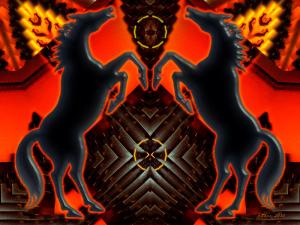
Very interesting piece of work. i always like mirrored images, they work well. the colours you ve chosen are really good, and the composition really catches your eyes.
well done
      |
Very interesting piece of work. i always like mirrored images, they work well. the colours you ve chosen are really good, and the composition really catches your eyes.
well done
Comment Written 19-Aug-2010
Comment from Mubashir Iqbal
This is nice work.
I like the blacks on the bold reds.
The details within and the patterns look great.
Very nice finishing here.
If I was to go for a crest, I know who to call:)
Nice work and thanks for the share.
      |
This is nice work.
I like the blacks on the bold reds.
The details within and the patterns look great.
Very nice finishing here.
If I was to go for a crest, I know who to call:)
Nice work and thanks for the share.
Comment Written 19-Aug-2010
Comment from StRyCh9
Hi Shawn, i like your color palette on this one, it would wake up even the dead! detail is great and your presentation of pattern superb. The depth youve created in this has made it a most viewable and enjoyable image. Keep them coming:)
reply by the author on 19-Aug-2010
      |
Hi Shawn, i like your color palette on this one, it would wake up even the dead! detail is great and your presentation of pattern superb. The depth youve created in this has made it a most viewable and enjoyable image. Keep them coming:)
Comment Written 19-Aug-2010
reply by the author on 19-Aug-2010
-
Thank you so very much, StRy. I really appreciate wonderful comments. Be careful of those tigers down there in Africa :))
-
lol, we have tigers now! Some clown thinks he is doing his bit for conservation here by trying to breed them in africa but in a totally alien habitat, poor souls I hope they adapt. Glad to see you havent lost your humor:) and that memory, lol, elephants can go sleep:))
Comment from emeraldheart
Great creative presentation to grab your attention and see all the fine details.Good blance and attention to detail make for a complete composition to enjoy.I like the texture to the center of it to add interest.Good color harmony to bring depth and highlight all aspects.Enjoyed.Thank you.
      |
Great creative presentation to grab your attention and see all the fine details.Good blance and attention to detail make for a complete composition to enjoy.I like the texture to the center of it to add interest.Good color harmony to bring depth and highlight all aspects.Enjoyed.Thank you.
Comment Written 19-Aug-2010
Comment from flanders
Bet the "popular chicken take-out" never thought their freezer door would look this interesting lol. Great work Shawn. Very dramatic. The horses stand out well against the background. Super job. flanders
      |
Bet the "popular chicken take-out" never thought their freezer door would look this interesting lol. Great work Shawn. Very dramatic. The horses stand out well against the background. Super job. flanders
Comment Written 19-Aug-2010
Comment from Jode
Very striking piece of work. Great colors and really good arrangement in terms of use of space and symmetry. The horses are not lost even though the background is quite busy. Well composed piece with lots of visual pull.
       |
Very striking piece of work. Great colors and really good arrangement in terms of use of space and symmetry. The horses are not lost even though the background is quite busy. Well composed piece with lots of visual pull.
Comment Written 19-Aug-2010
Comment from focaldot
Hiya ;) How you doing? its good to be back for a while lol I always like how you play with pictures or digital art. Very nicely composed, and i like the highlights. Well done and keep it up!
      |
Hiya ;) How you doing? its good to be back for a while lol I always like how you play with pictures or digital art. Very nicely composed, and i like the highlights. Well done and keep it up!
Comment Written 19-Aug-2010
Comment from Robin Gillow
What an attention grabber this piece is? You composition is good as is the colour and overall viewing appeal. Simple and well balanced, I am sure you are happy with this? Robin
      |
What an attention grabber this piece is? You composition is good as is the colour and overall viewing appeal. Simple and well balanced, I am sure you are happy with this? Robin
Comment Written 18-Aug-2010
Comment from Markjohno1975
Great work...I love the composition and the colours add to the piece.
I could see this being used as a logo for a business either a nightclub or stables.
Great piece..thanks for sharing!
      |
Great work...I love the composition and the colours add to the piece.
I could see this being used as a logo for a business either a nightclub or stables.
Great piece..thanks for sharing!
Comment Written 18-Aug-2010
Comment from mayapet
Fantastic piece! I love the bright colors and the pattern you choose. I've always found kaleidoscope effects very eye-captivating and irresistible. It almost looks like a depiction of an old Native American legend. There is great symbolism in it. Great job, thanks for sharing.
      |
Fantastic piece! I love the bright colors and the pattern you choose. I've always found kaleidoscope effects very eye-captivating and irresistible. It almost looks like a depiction of an old Native American legend. There is great symbolism in it. Great job, thanks for sharing.
Comment Written 18-Aug-2010
