Misc. Works
Viewing comments for Page 35 "Shipwreck II"Odds and Ends
27 total reviews
Comment from josipher32
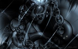
I'm not a fan of abstract art, but this is a very itnriguing piece. I like the little fishies moving across the peice. Very good attention to detail there.
      |
I'm not a fan of abstract art, but this is a very itnriguing piece. I like the little fishies moving across the peice. Very good attention to detail there.
Comment Written 22-Sep-2010
Comment from cassaaam
initial impact good
composition good
color good
technical excellence good
subject difficulty good
overall presentation good
fractals are great to play with, nice composition, like your little fish, well done
      |
initial impact good
composition good
color good
technical excellence good
subject difficulty good
overall presentation good
fractals are great to play with, nice composition, like your little fish, well done
Comment Written 22-Sep-2010
Comment from PhotosByGarth
This is very cool, but I really miss the colors. I do like pretty much everything else about this artwork. I'm afraid I can't really see the shipwreck. Thanks for sharing.
This rating does not count towards story rating or author rank.
The highest and the lowest rating are not included in calculations.
      |
This is very cool, but I really miss the colors. I do like pretty much everything else about this artwork. I'm afraid I can't really see the shipwreck. Thanks for sharing.
This rating does not count towards story rating or author rank.
The highest and the lowest rating are not included in calculations.
Comment Written 22-Sep-2010
Comment from jgrace
Well, for all the problems you had with the KPT filters, this is amazing. Lots of wonderful shapes & textures here. Love the tone of it also. It does remind me of a ship broken up on the shore. Great composition. Love it!
      |
Well, for all the problems you had with the KPT filters, this is amazing. Lots of wonderful shapes & textures here. Love the tone of it also. It does remind me of a ship broken up on the shore. Great composition. Love it!
Comment Written 22-Sep-2010
Comment from Macrogirl
This is a unique piece of digital artwork. It shows great imagination the contrast color is neat. And the inner image very unusual detail is very good. This is one of a kind for sure. Good job.
      |
This is a unique piece of digital artwork. It shows great imagination the contrast color is neat. And the inner image very unusual detail is very good. This is one of a kind for sure. Good job.
Comment Written 21-Sep-2010
Comment from V Tow
I think this piece is pleasing to the eye.
B/W adds interest to this.
I could see this in a black frame and on most anyones walls and it be a conversation piece but also it be loved for the beauty of the shot. The lights and darks are really nice. I love the contrast.
Good job!
      |
I think this piece is pleasing to the eye.
B/W adds interest to this.
I could see this in a black frame and on most anyones walls and it be a conversation piece but also it be loved for the beauty of the shot. The lights and darks are really nice. I love the contrast.
Good job!
Comment Written 21-Sep-2010
Comment from bkrh4
This is certianly intense and very dark. Storng detail and use of light really neat piece of work. I like the detil in the chain also the little fish in the bottom right corner are a nice touch.
      |
This is certianly intense and very dark. Storng detail and use of light really neat piece of work. I like the detil in the chain also the little fish in the bottom right corner are a nice touch.
Comment Written 21-Sep-2010
Comment from Ross Albert
Very cool. I like the nightmarish limited palatte, the swirls, the multiple layers of chains, and the corrosive looking fractal details. Really fun, Shawn.
      |
Very cool. I like the nightmarish limited palatte, the swirls, the multiple layers of chains, and the corrosive looking fractal details. Really fun, Shawn.
Comment Written 21-Sep-2010
Comment from nonarom
Beautiful! At the first glance I thought it's an abandoned spaceship, but then I noticed the chains and the fish; I love these monochrome tones and the sophisticated shapes you created here; the light suggests exactly the depth of the ocean.
Nona
       |
Beautiful! At the first glance I thought it's an abandoned spaceship, but then I noticed the chains and the fish; I love these monochrome tones and the sophisticated shapes you created here; the light suggests exactly the depth of the ocean.
Nona
Comment Written 21-Sep-2010
Comment from Pauljk
Very nice abstract image that would make a great album cover. The chain links look very goos and the overall tonal contrast works well with the subtle use of colour. The fish contrast nicely against the large chain link in the background. Paul
      |
Very nice abstract image that would make a great album cover. The chain links look very goos and the overall tonal contrast works well with the subtle use of colour. The fish contrast nicely against the large chain link in the background. Paul
Comment Written 21-Sep-2010
