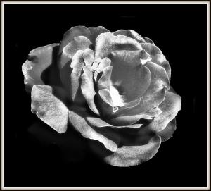
Silver rose
Rose in black and white47 total reviews
Comment from hetti
I do like the silver rose! And the black background makes a stunning contrast. Your focus is pin-sharp, composition is good and effects are lovely.
reply by the author on 06-Feb-2011
      |
I do like the silver rose! And the black background makes a stunning contrast. Your focus is pin-sharp, composition is good and effects are lovely.
Comment Written 06-Feb-2011
reply by the author on 06-Feb-2011
-
Thank you very much
Comment from WolfPause
Beautifully captured
Creative
What is a lomo-ish filter???
Focus is perfect
Edging is crisp
Love the silverish effect
Nice depth shown with the shadows
Love the black background
reply by the author on 06-Feb-2011
      |
Beautifully captured
Creative
What is a lomo-ish filter???
Focus is perfect
Edging is crisp
Love the silverish effect
Nice depth shown with the shadows
Love the black background
Comment Written 05-Feb-2011
reply by the author on 06-Feb-2011
-
Lomo-ish filter is something you find in a edit program called Picnik. Makes the rose shine like silver. You find it on the net under Picnik.com. It is not expensive to use, and a lot easier than Photoshop. Of course you cannot compare, bit it does a lot for you. Thank you for a nice review
Comment from Pat Groleau
I really like what you have done to make the rose look so awesome. It does look silver. I love the great tones and highlights. I love the black background. Love it!
Pat
reply by the author on 06-Feb-2011
      |
I really like what you have done to make the rose look so awesome. It does look silver. I love the great tones and highlights. I love the black background. Love it!
Pat
Comment Written 05-Feb-2011
reply by the author on 06-Feb-2011
-
Thank you very much
-
It is always my pleasure to review your work. Pat
Comment from steve's lot
nice entry for the competition. like how you have managed to keep the detail in the petals after converting. good luck
reply by the author on 06-Feb-2011
      |
nice entry for the competition. like how you have managed to keep the detail in the petals after converting. good luck
Comment Written 05-Feb-2011
reply by the author on 06-Feb-2011
-
Thank you very much
Comment from derrylynne
You have done a good job of changing the color although why apart from an experiment with photos change the color. The usual black background keeps the eye on the rose. The whirls of the rose showing well.
reply by the author on 05-Feb-2011
      |
You have done a good job of changing the color although why apart from an experiment with photos change the color. The usual black background keeps the eye on the rose. The whirls of the rose showing well.
Comment Written 05-Feb-2011
reply by the author on 05-Feb-2011
-
Thank you very much
Comment from Irenee
love the contrasts and black background really makes the subject stand out. would like to have seen the center of the rose with some detail though. thanks for the post.
reply by the author on 05-Feb-2011
       |
love the contrasts and black background really makes the subject stand out. would like to have seen the center of the rose with some detail though. thanks for the post.
Comment Written 05-Feb-2011
reply by the author on 05-Feb-2011
-
Thank you very much
Comment from GaliaG
very interesting piece, the rose looks like it is made from silver or same other metal
good details, filling of the frame and contrast with the backgorund
good luck with the contest
reply by the author on 05-Feb-2011
      |
very interesting piece, the rose looks like it is made from silver or same other metal
good details, filling of the frame and contrast with the backgorund
good luck with the contest
Comment Written 05-Feb-2011
reply by the author on 05-Feb-2011
-
Thank you very much
Comment from basilbaby
Very nice,
center of interest 5,
storytelling 5,
use of medium 5,
black and white makes the rose stand out.
reply by the author on 05-Feb-2011
      |
Very nice,
center of interest 5,
storytelling 5,
use of medium 5,
black and white makes the rose stand out.
Comment Written 05-Feb-2011
reply by the author on 05-Feb-2011
-
Thank you very much
Comment from haleyhobbs1994
it looks like white charcoal! wow, that amazing what you did. it does look silver, but it also looks more drawn rather than a photo. thats a good thing by the way! i love the lightng and i love the color. keep this up and youll be a famouse artist! beautiful work!
-haley
reply by the author on 04-Feb-2011
      |
it looks like white charcoal! wow, that amazing what you did. it does look silver, but it also looks more drawn rather than a photo. thats a good thing by the way! i love the lightng and i love the color. keep this up and youll be a famouse artist! beautiful work!
-haley
Comment Written 04-Feb-2011
reply by the author on 04-Feb-2011
-
Thank you very much
Comment from tortogle
I really like what you did to highlight this rose against the black background. It stands out well and is an overall interesting concept and image.
reply by the author on 04-Feb-2011
      |
I really like what you did to highlight this rose against the black background. It stands out well and is an overall interesting concept and image.
Comment Written 04-Feb-2011
reply by the author on 04-Feb-2011
-
Thank you very much
