
Misc.
Viewing comments for Page 66 "The Knights"This is just different picturs.
3 total reviews
Comment from jerrid
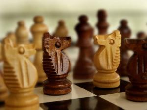
This is a pretty cool picture! I love how the the focus is on the two horses meanwhile they other pieces is in a soft blur! The color is good and the focus is good!
Awesome job with this picture!! Thank you for sharing! Good luck in the contest!
reply by the author on 03-Aug-2012
  |
This is a pretty cool picture! I love how the the focus is on the two horses meanwhile they other pieces is in a soft blur! The color is good and the focus is good!
Awesome job with this picture!! Thank you for sharing! Good luck in the contest!
Comment Written 03-Aug-2012
reply by the author on 03-Aug-2012
-
Thank you so very much!
Comment from jdeverich
Well executed, the exposure and colours are spot on.
I might try to take a little yellow caste away from the white squares and background. Giving a pure white might add to the theme of good and evil.
Nice depth of field blurring the non focus pieces and I like the lines of the board drawing the eye to the knights.
My only real critique is in the use of compositional rules the two pieces are neither centered or placed neatly by the rule of thirds. Maybe this could be achieved by a tighter crop or a slight change in angle of the camera.
reply by the author on 03-Aug-2012
 |
Well executed, the exposure and colours are spot on.
I might try to take a little yellow caste away from the white squares and background. Giving a pure white might add to the theme of good and evil.
Nice depth of field blurring the non focus pieces and I like the lines of the board drawing the eye to the knights.
My only real critique is in the use of compositional rules the two pieces are neither centered or placed neatly by the rule of thirds. Maybe this could be achieved by a tighter crop or a slight change in angle of the camera.
Comment Written 03-Aug-2012
reply by the author on 03-Aug-2012
-
Thank you for the review and suggestions. I will try a tighter crop.
Comment from Cassandra01
Love it! Very creative. The board itself is an interesting subject and the pieces only accentuate it. Great focus and dof here. Lovely image!
reply by the author on 03-Aug-2012
|
Love it! Very creative. The board itself is an interesting subject and the pieces only accentuate it. Great focus and dof here. Lovely image!
Comment Written 03-Aug-2012
reply by the author on 03-Aug-2012
-
Thank you so very much!