Misc. Works
Viewing comments for Page 26 "Not Entirely Correct"Odds and Ends
42 total reviews
Comment from MKFlood
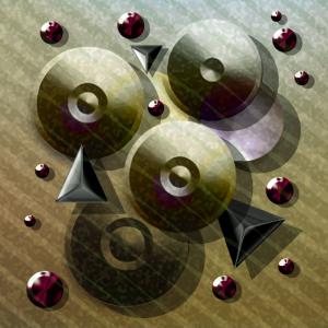
great job on the layout..it has a 3 effect to it with the circular objects overlay. the blend of color is good. this would make a good print for the wall. very creative and great job overall.
      |
great job on the layout..it has a 3 effect to it with the circular objects overlay. the blend of color is good. this would make a good print for the wall. very creative and great job overall.
Comment Written 07-Jan-2013
Comment from greenmountaingirl
great abstaract, love tones, color, overall image is unique and different very well done and99 want to see 9m9ore in this vein from you
      |
great abstaract, love tones, color, overall image is unique and different very well done and99 want to see 9m9ore in this vein from you
Comment Written 07-Jan-2013
Comment from Mara del Mar
Great use of shapes and lines for this creation. Very nice tonal range. Great texture and equilibrium. Nice gradient. Great work.
Mara.
      |
Great use of shapes and lines for this creation. Very nice tonal range. Great texture and equilibrium. Nice gradient. Great work.
Mara.
Comment Written 06-Jan-2013
Comment from Stacey Nagy
This is a very cool looking image. I like these shapes, and the look of metal. And the texture is great looking. Very good highlights and shadows giving the look of great lighting. This is really fun to view, and I am sure it was fun to create.
Stacey
      |
This is a very cool looking image. I like these shapes, and the look of metal. And the texture is great looking. Very good highlights and shadows giving the look of great lighting. This is really fun to view, and I am sure it was fun to create.
Stacey
Comment Written 06-Jan-2013
Comment from AKMIDGE
This is an interesting creation. like the color choices, the simplicity and organization. Not so sure about the lines going through it but it does work.
      |
This is an interesting creation. like the color choices, the simplicity and organization. Not so sure about the lines going through it but it does work.
Comment Written 06-Jan-2013
Comment from photoman12
This would be good in an engineering dept. At first I thought they were door knobs. Than pullies of some kind. Now I think it just a nice design.
      |
This would be good in an engineering dept. At first I thought they were door knobs. Than pullies of some kind. Now I think it just a nice design.
Comment Written 06-Jan-2013
Comment from Highfive
i like the mechanical feel of your design with the embellish edges, and nice diagonal lines. the colors are awesome, especially the reds in the smaller spheres of ruby reds. i really like the three dimensional feel of 'not entirely correct' adds a lot of quality to our image. very professionally done and represented on far. thanks for sharing.
      |
i like the mechanical feel of your design with the embellish edges, and nice diagonal lines. the colors are awesome, especially the reds in the smaller spheres of ruby reds. i really like the three dimensional feel of 'not entirely correct' adds a lot of quality to our image. very professionally done and represented on far. thanks for sharing.
Comment Written 06-Jan-2013
Comment from Kenneth Dinkel
I really like these works that open the viewers creative mind. Stunning depth and use of reflection. Reminds one of the famous sculpture works of Chris Bathgate's.
      |
I really like these works that open the viewers creative mind. Stunning depth and use of reflection. Reminds one of the famous sculpture works of Chris Bathgate's.
Comment Written 06-Jan-2013
Comment from ozzyart
Interesting composition, almost formal yet not. I like the shapes and the "lighting on each piece, though the direction of the light source on the larger shapes, is different to the smaller red shapes and triangles. I feel if the lowest large round shape was smaller, it would improve the composition.
Well done anyway!
      |
Interesting composition, almost formal yet not. I like the shapes and the "lighting on each piece, though the direction of the light source on the larger shapes, is different to the smaller red shapes and triangles. I feel if the lowest large round shape was smaller, it would improve the composition.
Well done anyway!
Comment Written 06-Jan-2013
Comment from corrinas creations
I really like this. haven't seen an abstract quite like it. Just love the 3d aspect of it, its really added a little something special. And all the shadows and light reflections are such a nice touch. Very well created, you clearly know your craft well
      |
I really like this. haven't seen an abstract quite like it. Just love the 3d aspect of it, its really added a little something special. And all the shadows and light reflections are such a nice touch. Very well created, you clearly know your craft well
Comment Written 06-Jan-2013
