Misc.
Viewing comments for Page 117 "Nature Beads"This is just different picturs.
4 total reviews
Comment from Diane Di Maio
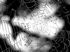
This is an amazing photo, Part of the web looks like the letter Y, The rain drops are like hundreds or more little beads, The shadow in the background was well proportioned, very nice.
reply by the author on 13-Jan-2014
       |
This is an amazing photo, Part of the web looks like the letter Y, The rain drops are like hundreds or more little beads, The shadow in the background was well proportioned, very nice.
Comment Written 13-Jan-2014
reply by the author on 13-Jan-2014
-
Thank you so very much for your review and comments! Thanks also for the high score!
Comment from jrconrad
Really nice job. I've seen a zillion spider webs but this one is unique and well executed. I especially like the way you handled the foreground/background and the use of B&W. Very good.
reply by the author on 11-Jan-2014
      |
Really nice job. I've seen a zillion spider webs but this one is unique and well executed. I especially like the way you handled the foreground/background and the use of B&W. Very good.
Comment Written 11-Jan-2014
reply by the author on 11-Jan-2014
-
Thank you so very much!
Comment from braided
this is perfect for the contest .. the straight line and round �?� good job
its usually hard to photograph a spiders web
you have to pretty much spray it ..
you did a great job of the web but having problems with the background - its distracting me from the actual image
reply by the author on 03-Jan-2014
       |
this is perfect for the contest .. the straight line and round �?� good job
its usually hard to photograph a spiders web
you have to pretty much spray it ..
you did a great job of the web but having problems with the background - its distracting me from the actual image
Comment Written 03-Jan-2014
reply by the author on 03-Jan-2014
-
Thank you so very much! I guess it just depends on who is looking, as the background to me added to it. Thank you for being honest!
Comment from Lethal005
yeah i like this one
B&W is agood choice
excellent patterns and focus
but wheres the architect got to?
doesnt he like dew?
empty webs are cool but spiders on them are cooler haha
well done
reply by the author on 03-Jan-2014
      |
yeah i like this one
B&W is agood choice
excellent patterns and focus
but wheres the architect got to?
doesnt he like dew?
empty webs are cool but spiders on them are cooler haha
well done
Comment Written 03-Jan-2014
reply by the author on 03-Jan-2014
-
Thank you so very much!
