Comment from
Lucien van Oosten
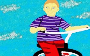
The colors used are effective and work well together. The main thing for me is that make sit lees then perfect as a composition, is the fact the bicycle looks wrong. It looks squeezed and out of proportion from the little bit shown. To me there needs to be more of it in the frame.
The title says Boy on Bicycle, so show me the bike, not the blue sky. It should have been frame vertically, so the majority of the bike and of him was on the digital paper.
Comment Written 24-May-2014
reply by the author on 25-May-2014
Thank you for taking the time to look at, and to review my artwork.
VMarguarite
Comment from
photobeat
that is so sweet, love the smile and the way you did the eyes, great paying to attention details and the color harmony in A1, beny ")
Comment Written 24-May-2014
reply by the author on 25-May-2014
Thank you kindly for your nice comments about my artwork, and I also appreciate your 5-Star rating.


