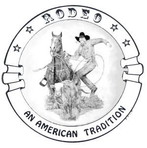
Rodeo An American Tradition CR
This is a print of images I created.15 total reviews
Comment from Lynjupiter
This is very nicely done. I like the image, it is well detailed and interesting. Good even spacing. It is another one I really like out of your rodeo series.
Lynda
reply by the author on 20-Feb-2006
  |
This is very nicely done. I like the image, it is well detailed and interesting. Good even spacing. It is another one I really like out of your rodeo series.
Lynda
Comment Written 20-Feb-2006
reply by the author on 20-Feb-2006
-
lynjuiter, thanks you for the great review. I'm very pleased that you like the series. The note cards look really good with the designs on them... take care and cheers... LvO
Comment from tigerflower
I recognize that cowboy!! I do like the composition and I think it works well with the border - but I still think this particular figure is a little too stiff. Overall, I do feel that this is a good graphic design.
This rating does not count towards story rating or author rank.
The highest and the lowest rating are not included in calculations.
reply by the author on 20-Feb-2006
 |
I recognize that cowboy!! I do like the composition and I think it works well with the border - but I still think this particular figure is a little too stiff. Overall, I do feel that this is a good graphic design.
This rating does not count towards story rating or author rank.
The highest and the lowest rating are not included in calculations.
Comment Written 20-Feb-2006
reply by the author on 20-Feb-2006
-
tigerflower, thank you for the time and the review, not sure what "too stiff" really means, it's like a stop motion shot... take care & Cheers... LvO
Comment from Jazzle
I'm giving this 5 because:
The picture in the centre of the logo is dramatic and immediately captures your attention.
The main figures are well definded and distinguished from each other.
The shading on the inside of the circle also helps add defination and depth to the image.
The contrast is strong in the shading of the picture.
reply by the author on 19-Feb-2006
|
I'm giving this 5 because:
The picture in the centre of the logo is dramatic and immediately captures your attention.
The main figures are well definded and distinguished from each other.
The shading on the inside of the circle also helps add defination and depth to the image.
The contrast is strong in the shading of the picture.
Comment Written 19-Feb-2006
reply by the author on 19-Feb-2006
-
Jazzle, so pleased you think this desreves the high rating, thanks for taking the time, really appreciate the review... take care as always Cheers... LvO
Comment from channeled
This is just wonderful! Really enjoy this very professional looking image designed with great skill and technique. Love the details and great precision in this. Fabulous work!
reply by the author on 19-Feb-2006
|
This is just wonderful! Really enjoy this very professional looking image designed with great skill and technique. Love the details and great precision in this. Fabulous work!
Comment Written 19-Feb-2006
reply by the author on 19-Feb-2006
-
channeled, thank you for the wonderful compliments regarding this design, much appreciated... take care & cheers... LvO
Comment from David Hemmings
this is a very cool piece of work. I thought that it was an emblem for a rodeo when I first saw it. You are a talented person with the pencil, nice stuff here!
reply by the author on 18-Feb-2006
|
this is a very cool piece of work. I thought that it was an emblem for a rodeo when I first saw it. You are a talented person with the pencil, nice stuff here!
Comment Written 18-Feb-2006
reply by the author on 18-Feb-2006
-
David, thanks for the kind words and wonderful review... much appreciated... have a good day... cheers... LvO
Comment from Highfive
Wow, great pen, and ink work. i love that old theme with the cowboy, and his horse working to make in the wild wild west. your depiction of the cowboy really illustrates is great way of life excellently. it shows your great love for the subject matter, and your dedication to your craft. very nice work.
highfive
reply by the author on 18-Feb-2006
|
Wow, great pen, and ink work. i love that old theme with the cowboy, and his horse working to make in the wild wild west. your depiction of the cowboy really illustrates is great way of life excellently. it shows your great love for the subject matter, and your dedication to your craft. very nice work.
highfive
Comment Written 18-Feb-2006
reply by the author on 18-Feb-2006
-
highfive, thank you for the wonderful review, I'm glad you like my work. Take care and as always cheers... LvO
Comment from wolf6249107
nicely done and created..you seem to be gaining both knowledge adn wisdom from reviews..I applaude yopu my friend
well done adn keep up the great work and learning
keep them a coming
reply by the author on 18-Feb-2006
|
nicely done and created..you seem to be gaining both knowledge adn wisdom from reviews..I applaude yopu my friend
well done adn keep up the great work and learning
keep them a coming
Comment Written 18-Feb-2006
reply by the author on 18-Feb-2006
-
wolf6249107, yep! always willing to think about what is said, doing well... now that's another story... thanks for the review much appreciated... take care ...Cheers... LvO
Comment from tomandsusan
Really nice resolution on this work. You have brought to life the feel of the rodeo. Very nice drawing. Wonderful pencil work. Good job.
reply by the author on 18-Feb-2006
|
Really nice resolution on this work. You have brought to life the feel of the rodeo. Very nice drawing. Wonderful pencil work. Good job.
Comment Written 18-Feb-2006
reply by the author on 18-Feb-2006
-
T&S, thanks for looking and the time to write the review, really appreciated... take care and cheers... LvO
Comment from faisoft
I like this pencil drawing a great deal. It is very real. The color contrast is nicely done. The shadowing is well balanced. Did I see something like that before? Nice work.
reply by the author on 18-Feb-2006
|
I like this pencil drawing a great deal. It is very real. The color contrast is nicely done. The shadowing is well balanced. Did I see something like that before? Nice work.
Comment Written 18-Feb-2006
reply by the author on 18-Feb-2006
-
fairsoft, yes, I am taking the drawing and now incorporating them into a different design... they will be sold as blank note cards... wish me luck... thanks for the review and have a great weekend... and cheers... LvO
Comment from tallgirljessca
This work is extraordinary. The detail is amazing, making the horse and cattle look as if they were jumping out of the page. The shadowing is also very well done. Lovely peace of work.
reply by the author on 18-Feb-2006
|
This work is extraordinary. The detail is amazing, making the horse and cattle look as if they were jumping out of the page. The shadowing is also very well done. Lovely peace of work.
Comment Written 18-Feb-2006
reply by the author on 18-Feb-2006
-
tallgirljessca, thanks for the great review and kind words, glad you like this one, there are others, just look at my portfolio... and let me know what you think of them... take care and cheers... LvO