Comment from
avmurray
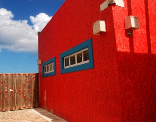
A really great shot. Creative and original, and also here I like the simplicity and all the fine lines and shapes. Crisp and clear, sharp and with a very good exposure. The composition is working as well. Good luck with the contest.
Comment Written 03-May-2018
reply by the author on 05-May-2018
Thank you so very much! I have never won the color contest, I hope there is enough of it here.
reply by avmurray on 07-May-2018
You are most welcome Willie.
Comment from
ArtistCharles
Nice shot. I like the subject and the colors, they create a very abstract feeling image. The one question I have is should you level the vertical line on the front corner, which I think is an artistic choice you should consider. For the viewer this is disorienting. Well imagined.
Comment Written 26-Apr-2018
reply by the author on 26-Apr-2018
Thank you so very much! I know what you are refering to as far as the vertical line but if I change that then the horizonal is off.
Comment from
nikman
You certainly got a lot of big and bright colour into this competition entry! Your find bold composition immediately commands interest and attention. Exposure and sharpness are good. Wonder what the building is for? Well done and good luck!
Comment Written 26-Apr-2018
reply by the author on 26-Apr-2018
tHANK YOU SO VERY MUCH! i DON'T KNOW WHAT THE BUILDING IS FOR.


