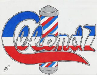
Cblendz Logo
commission work14 total reviews
Comment from jesuel
and a great logo it is the color composition is great the design is both creative and unique love the barber pole you portrayed it correctly beautiful work here
reply by the author on 28-Jan-2022
  |
and a great logo it is the color composition is great the design is both creative and unique love the barber pole you portrayed it correctly beautiful work here
Comment Written 28-Jan-2022
reply by the author on 28-Jan-2022
-
Thank #1 for the great review.
Comment from seshadri_sreenivasan
Great work bro. This is sure to attract many eyeballs and increase footfalls in his barbershop. Well done. He must be a very happy barbershop owner.
reply by the author on 28-Jan-2022
|
Great work bro. This is sure to attract many eyeballs and increase footfalls in his barbershop. Well done. He must be a very happy barbershop owner.
Comment Written 27-Jan-2022
reply by the author on 28-Jan-2022
-
I'm paid and he is smiling so yeah I think I did good..wink ..lol.thanks for the great review
Comment from Regina E.H-Ariel
Your order to create a new logo is excellent as it really contains what is needed -so all details are more than perfect , your color choice and combinations are perfect and very interesting as all is standing out in perfect harmony with an outstanding content -super presentation -thanks for sharing
reply by the author on 28-Jan-2022
|
Your order to create a new logo is excellent as it really contains what is needed -so all details are more than perfect , your color choice and combinations are perfect and very interesting as all is standing out in perfect harmony with an outstanding content -super presentation -thanks for sharing
Comment Written 26-Jan-2022
reply by the author on 28-Jan-2022
-
Thanks for the awesome review
-
you are more than welcome beloved friend
Comment from Daphne Oberon
I love the design and concept but in all honesty I cannot be sure what the skillfully ascribed letters say! Is looks like Cblemd Z, which can't be correct? And how about if the barber's "cone" were not right behind the already red white and blue lettering? Or better yet how about if the C and Z were left as is, the barber's spiral left as is, but the lettering in the middle converted to solid blue down to the red. I think my minus 5 star eyes could focus okay on that without the confusing central white strip that blends with the white background... Ah, another idea, keep the white but make it VERY thin line rather than an equal width... Still, thinking of advertising, i think more viewers would grasp this quickly if the central letters were all solid red. This would make them stand out better... This is nice work though, my points are not about that!
reply by the author on 26-Jan-2022
|
I love the design and concept but in all honesty I cannot be sure what the skillfully ascribed letters say! Is looks like Cblemd Z, which can't be correct? And how about if the barber's "cone" were not right behind the already red white and blue lettering? Or better yet how about if the C and Z were left as is, the barber's spiral left as is, but the lettering in the middle converted to solid blue down to the red. I think my minus 5 star eyes could focus okay on that without the confusing central white strip that blends with the white background... Ah, another idea, keep the white but make it VERY thin line rather than an equal width... Still, thinking of advertising, i think more viewers would grasp this quickly if the central letters were all solid red. This would make them stand out better... This is nice work though, my points are not about that!
Comment Written 26-Jan-2022
reply by the author on 26-Jan-2022
-
are you viewing this from your phone? just curious because on the computer screen the viewer can see that is a N..now im limited of freedom on this logo..the customer wanted the barber pole there in the middle...the customer wanted this to be red white and blue as well as the pole..i did suggest the things that you had already mentioned but sadly i have to live by the golden rule in this business..you know the golden rule right?. "yea who has the gold makes the rules" wink wink..thanks for comfirming what i have already said (thumbs up)
-
Oh good grief that was a typo on my part, my apologies! Yes I can see that it is an N on this laptop. Where does that quote come from, some Disney film, he who has the gold makes the rules, eh, eh.... yes I get it! Well another idea is to leave it as it is but saturate the red and blue on the lettering just a bit more so they are not exactly the same saturation as the barber pole. If doing this in Adobe Illustrator, I might experiment with a touch of drop-shadow effect to lend a 3d effect to the lettering -- that might work. What is this for -- a sign or letterhead or? You liked my slight 3D effect on the sunflowers, which are an example of drop-sahdow distinguishing the same content against itself. If you don't have the software I could give it a try for you -- ABSOLUTELY no charge of course -- just for fun! I would do better to have it in a tiff or JPEG than a screenshot from the FAR webpage... my email daphneoberon@gmail.com
-
the one thing in negotiations is to see what the other side wants and what are they willing to bend for. when a customer has something on their mind they would like to know when and above all how much. i watch for reaction of the customer as im asking the questions to narrow down what they are looking for. the man even came to me and says i want this C style like this...and he must have the red white blue done like this. like i said i listen to the golden rule..we might have cool ideas but it is the guy who is paying makes that final decision..wink./
-
Cool! Understood!
Comment from Carina Imbrogno
Wonderful creation my friend I love your logo. Letters are not easy to do and you did a phenomenal job with it. Love the colors you used as well. Beautifully drawn. Outstanding work my friend thank you so much for sharing
reply by the author on 28-Jan-2022
|
Wonderful creation my friend I love your logo. Letters are not easy to do and you did a phenomenal job with it. Love the colors you used as well. Beautifully drawn. Outstanding work my friend thank you so much for sharing
Comment Written 26-Jan-2022
reply by the author on 28-Jan-2022
-
Thanks for the great review
Comment from Cindy Sue Truman
Your work is so awesome and creative. I love this logo. It is so perfect for a barbershop logo and a wonderful signature trade mark. For: " Mouth, Nose and Cheeks, the lather hides: Light, Smooth and Swift the Razor will Glide". "Red bandage's swirl and hung with care beckon all beards to be shaved with care". So glad you did clean red swirls. I am sure your client loved this as much as I. Creative and so different. Bravo my friend. ~
reply by the author on 28-Jan-2022
 |
Your work is so awesome and creative. I love this logo. It is so perfect for a barbershop logo and a wonderful signature trade mark. For: " Mouth, Nose and Cheeks, the lather hides: Light, Smooth and Swift the Razor will Glide". "Red bandage's swirl and hung with care beckon all beards to be shaved with care". So glad you did clean red swirls. I am sure your client loved this as much as I. Creative and so different. Bravo my friend. ~
Comment Written 25-Jan-2022
reply by the author on 28-Jan-2022
-
I got paid..wink..lol. thanks for the awesome review
Comment from Barbara L.
This is a great logo for a barbershop using a barber pole for your inspiration and part of the design! It's very eye-catching and will draw a lot of attention to the shop.
reply by the author on 28-Jan-2022
|
This is a great logo for a barbershop using a barber pole for your inspiration and part of the design! It's very eye-catching and will draw a lot of attention to the shop.
Comment Written 25-Jan-2022
reply by the author on 28-Jan-2022
-
Thanks Barbara for the great review
Comment from iPhone7
Very cool logo. You have begun a new chapter Troop. A BIG HoooRaaah!
Keep up the Outstanding work Red Leg. You are making us proud ~ Top
reply by the author on 28-Jan-2022
|
Very cool logo. You have begun a new chapter Troop. A BIG HoooRaaah!
Keep up the Outstanding work Red Leg. You are making us proud ~ Top
Comment Written 25-Jan-2022
reply by the author on 28-Jan-2022
-
Thanks Top!
Comment from alaskapat
Hi Mark, this is an awesome barber shop logo, for Cblendz Barber shop, I like the red white and blue and of course the pole , lettering is very well placed and I like the style of the text.
Well created, arranged and presented!
reply by the author on 28-Jan-2022
|
Hi Mark, this is an awesome barber shop logo, for Cblendz Barber shop, I like the red white and blue and of course the pole , lettering is very well placed and I like the style of the text.
Well created, arranged and presented!
Comment Written 25-Jan-2022
reply by the author on 28-Jan-2022
-
Thanks Pat for the great review
Comment from cleo85
I guess that the logo features the name of the barber. The horizontal shape looks like a combination of a knife and a scissor. The combination of its swaying shape with the tube at the background is interesting. Your clean and experienced pen-strokes are impressive. The logo is well composed. The composition is balanced.
reply by the author on 28-Jan-2022
|
I guess that the logo features the name of the barber. The horizontal shape looks like a combination of a knife and a scissor. The combination of its swaying shape with the tube at the background is interesting. Your clean and experienced pen-strokes are impressive. The logo is well composed. The composition is balanced.
Comment Written 25-Jan-2022
reply by the author on 28-Jan-2022
-
Thanks cleo for the great review.